Screen components: layout, content and actions
Available with Kino 0.9.74
Available from Kino 0.9.74. An older Kino refuses these plugins with
«Este plugin necesita una versión más nueva de Kino»; to keep reaching people on an older version use
enhancements (see Screens without raising your apiVersion).
Everything on this page needs "apiVersion": 14. Every component a plugin screen can draw, one section each: what it is for, its properties, a JSON tree, the same in
plugin JavaScript, how it behaves on the phone and on the TV, its limits and the mistakes to avoid. It is the companion of
the Screens guide, which explains the model (the manifest, the exports, state and events); this page and the
two after it are the catalogue.
The property tables come from the contract (contract.json), so their names, defaults and numbers are the ones the app
enforces; kino.d.ts types every node (KinoScreenNode). To see every component running, install the
gallery example: one tab per group, each component in its own
labelled section.
Component families
The catalogue is split across three pages:
| Page | Families | Components |
|---|---|---|
| This page | Layout, Content, Actions | Column · Row · Twelve-column row · Stack · Positioned children · Spacer and SizedBox · Divider · Scroll · GridView · ListView · TabBar · ExpansionTile · steps · Card · Scaffold (AppBar, NavigationBar) · PageView · pages · ListTile · Text · Text scale · Colours · Image · Icon (names) · Badge · CircleAvatar · MaterialBanner · Progress bar · Spinner · Skeleton · QrImage (countdown) · DataTable (TableRow, TableCell) · emptyState · errorState · titleCard · titleRail · titleGrid · heroCard · Actions and events · Buttons (busy presses) · FloatingActionButton · Tooltip · Chips · Toasts · Local ui operations |
| Forms, overlays and navigation | Forms, Overlays, Navigation | Form, TextField (secret fields, several lines), DropdownButton, RadioGroup, Checkbox, Switch, Slider, NumberStepper, focus on TV, validation, patterns, submit rules, the settings node, bind and config; Dialog, Sheet, Menu, declared pop-ups and onClose; every go.* and routes |
| Data, behaviour and recipes | Data and behaviour, Recipes | State, inputs, events, answers, timers, per-size values, Flutter-style names, style, common, shared, box and text properties, animations, tokens, limits; recipes (news grid, settings form, confirmation pop-up, tabs with chips, button matrix, app bar with tabs and a floating button) |
Quick start
A screen plugin is a manifest with the screen capability and two exports. This one shows a card with a picture, a title
and a button; the button's event answers a state patch, and Kino draws the screen again.
kino-plugin.json:
{
  "id": "hello-card",
  "name": "Tarjeta",
  "version": "1.0.0",
  "apiVersion": 14,
  "entry": "plugin.js",
  "hosts": ["kinotvapp.github.io"],
  "capabilities": ["screen"],
  "screen": { "label": "Tarjeta", "labelEn": "Card", "icon": "star", "menuOpens": "screen" }
}
plugin.js:
export async function screen({ state }) {
  const liked = state.liked === true;
  return { type: "SingleChildScrollView", children: [{ type: "Column", padding: 16, gap: 12, children: [
    { type: "Card", key: "film", flush: true, children: [
      { type: "Image", url: "https://peach.blender.org/wp-content/uploads/title_anouncement.jpg", aspect: "16:9", alt: "Big Buck Bunny" },
      { type: "Column", padding: 12, gap: 8, children: [
        { type: "Text", text: "Big Buck Bunny", style: "h3" },
        { type: "Text", text: liked ? "Te gusta" : "Una película libre de 2008", textEn: liked ? "You like it" : "A free film from 2008", color: "muted" },
        { type: "ElevatedButton", key: "like", icon: "heart", labelText: "Me gusta", labelTextEn: "Like", onPressed: "like", enabled: !liked },
      ] },
    ] },
  ] }] };
}

export async function screenEvent({ name }) {
  return name === "like" ? { state: { liked: true }, toast: "¡Gracias!", toastEn: "Thanks!" } : null;
}
Try it with the kit, before any device (Test locally): node sdk/validate.mjs <folder>,
node sdk/run.mjs <folder> screen, node sdk/run.mjs --device tv <folder> screen and
node sdk/run.mjs --state '{}' <folder> screenEvent like.
Reading this page
- Names. Each section is titled with the Flutter-style name this page writes (
Column,TextField...); the older lowercase name Kino reads internally (col,textInput...) is accepted too, and the kit's log lines use it. See Flutter-style names. - Property tables. Default is what Kino uses when you leave the property out; Per size says whether the property
takes a per-size map
{ compact, medium, expanded }(Per-size values). Every node also takes the common properties and the style, which are not repeated. - Validation never crashes. A wrong value, an unknown type or a property out of place is dropped with a log line and
the rest is drawn. Run
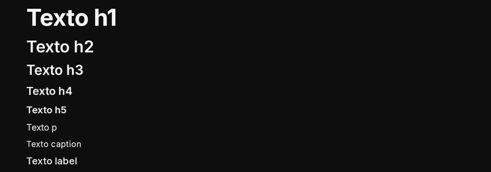
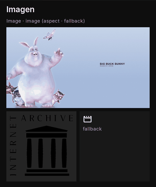
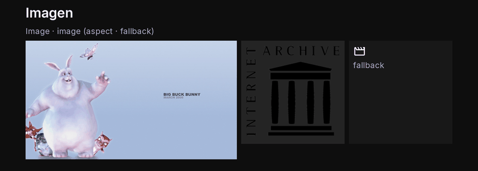
node sdk/run.mjs <folder> screen: every dropped thing is printed. - Pictures. Where a section shows two pictures, they are the real renderer drawing the gallery example, on a phone and on a TV.
Layout
Containers place their children; none of them draws anything of its own except Card, Divider and the tabs. The canvas
does not scroll by itself: put a long page in a SingleChildScrollView or a ListView.
Column
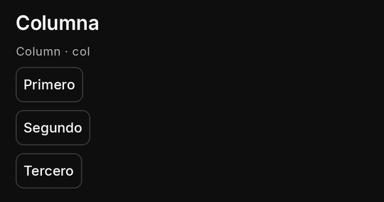
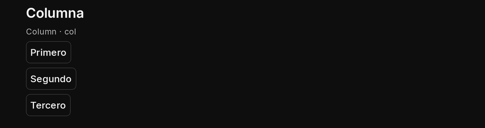
Children one under the other: the backbone of almost every screen. gap spaces them, crossAxisAlignment places them
across the width (stretch makes each as wide as the column) and mainAxisAlignment along the height. A child with
flex takes its share of the height left over.
| Property | Type | Default | Per size | Notes |
|---|---|---|---|---|
children |
nodes[] | none | no | its children, drawn in order |
{ "type": "Column", "gap": 8, "crossAxisAlignment": "stretch", "children": [
  { "type": "Text", "text": "Primero", "textEn": "First" },
  { "type": "Text", "text": "Segundo", "textEn": "Second" }
] }
export async function screen() {
  const lines = ["Primero", "Segundo", "Tercero"];
  return { type: "Column", gap: 8, padding: 16, children: lines.map((text) => ({ type: "Text", text })) };
}
- TV: focus moves Down and Up through the column's focusable children, to the neighbour's nearest edge.
- Phone and TV: identical layout; use per-size
paddingandgapfor the larger screen. - Limits and mistakes: a root
Columntaller than the window is cut, not scrolled. Depth counts: at most 10 levels of nesting in a tree.
Row
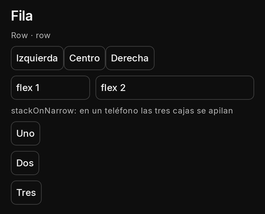
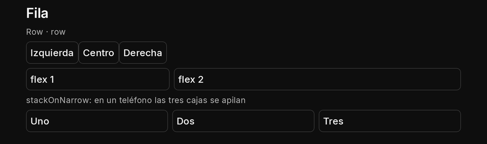
Children side by side. flex shares the width (flex: 1 and flex: 2 take a third and two thirds), mainAxisAlignment
spreads them (spaceBetween, spaceAround), crossAxisAlignment aligns them on the row's height. With stackOnNarrow
the row becomes a column on a compact width; with wrap: true it is the twelve-column layout.
| Property | Type | Default | Per size | Notes |
|---|---|---|---|---|
children |
nodes[] | none | no | its children, drawn in order |
wrap |
boolean | false |
yes | true: the twelve-column layout, children placed by span and offset on lines of 12 columns (Twelve-column row) |
stackOnNarrow |
boolean | false |
yes | on a compact width the children stack as a column; ignored with wrap |
{ "type": "Row", "gap": 8, "stackOnNarrow": true, "children": [
  { "type": "Card", "flex": 1, "children": [{ "type": "Text", "text": "Uno", "textEn": "One" }] },
  { "type": "Card", "flex": 2, "children": [{ "type": "Text", "text": "Dos", "textEn": "Two" }] }
] }
export async function screen() {
  const box = (text, flex) => ({ type: "Card", flex, children: [{ type: "Text", text }] });
  return { type: "Row", gap: 8, mainAxisAlignment: "spaceBetween", children: [box("A", 1), box("B", 2)] };
}
- TV: Left and Right move between the row's focusable children, a
TabBarorChipsin it included (Right from its last tab reaches the control after it). Keep TV rows short. - Phone and TV:
stackOnNarrowonly changes compact widths (a phone upright); a TV isexpanded. - Limits and mistakes:
stretchin a plain row draws asstart(a row has no intrinsic height to stretch to);flexis 1 to 12;spanandoffsetmean nothing here (only withwrap).
Twelve-column row (wrap: true)
Bootstrap's grid inside Kino: a Row with wrap: true lays its children on lines of 12 columns. Each child takes its
span (1 to 12, or "auto", the default) after its offset; a child that does not fit what is left of the line starts
the next one. An "auto" button, Badge or Icon is never narrower than its label: when it does not fit it starts the
next line, and the "auto"s of a line share what is left without going under their own width. With per-size spans it is
col-12 col-md-6 col-lg-4: one card per line on a phone, two on a medium window, three on a TV. gap goes between cells
and between lines.
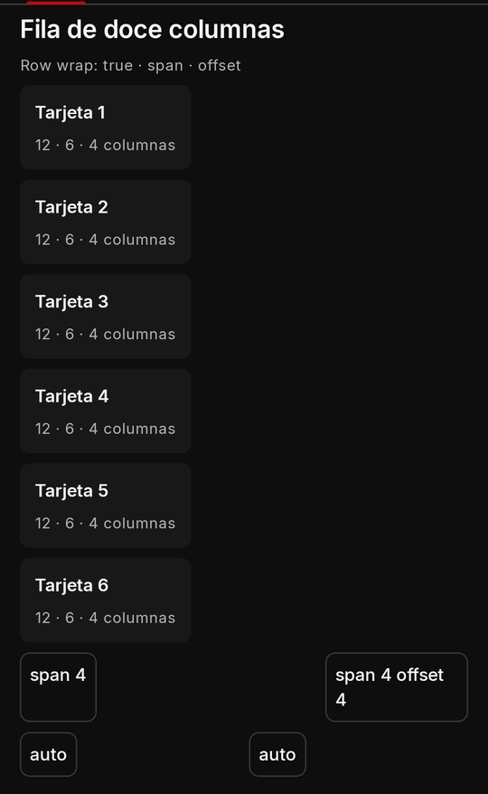
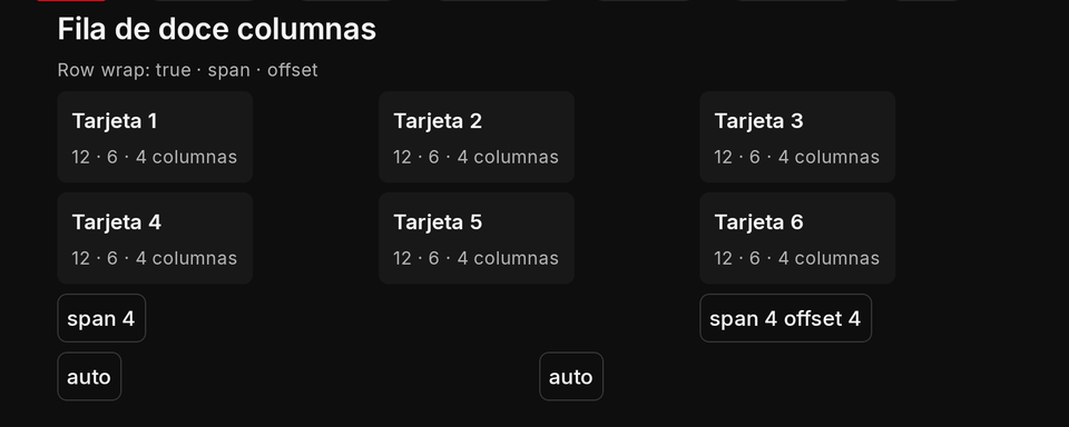
{ "type": "Row", "wrap": true, "gap": 12, "children": [
  { "type": "Card", "key": "a", "span": { "compact": 12, "medium": 6, "expanded": 4 }, "children": [{ "type": "Text", "text": "A" }] },
  { "type": "Card", "key": "b", "span": { "compact": 12, "medium": 6, "expanded": 4 }, "children": [{ "type": "Text", "text": "B" }] },
  { "type": "Card", "key": "c", "span": 4, "offset": 4, "children": [{ "type": "Text", "text": "C" }] }
] }
export async function screen() {
  const cards = ["Uno", "Dos", "Tres", "Cuatro"].map((text, i) => ({
    type: "Card", key: "card" + i, span: { compact: 12, medium: 6, expanded: 4 }, children: [{ type: "Text", text }],
  }));
  return { type: "SingleChildScrollView", children: [{ type: "Row", wrap: true, gap: 12, padding: 16, children: cards }] };
}
- TV: the grid keeps Left and Right inside itself (they never escape past the last cell); Down and Up go to the nearest cell of the next line, so a matrix of buttons keeps its columns (see the button matrix recipe).
- Phone and TV: a line is as tall as its tallest cell and, by default, every
Cardor container cell without a fixedwidth/heightis drawn that tall, so a grid of cards is even;crossAxisAlignmentstart,centerorendkeeps each at its own height. Inside a sideways scroll the twelve columns are laid out on 600 dp. - Limits and mistakes:
flex,mainAxisAlignmentandstackOnNarrowmean nothing in a wrapping row; a child takes its natural width unlessfill: true.spanandoffsetanywhere else are ignored (logged). A line holding something that cannot be measured (a lazy list, a rail, tabs, a table, the settings form) is left unstretched. A hidden child leaves no gap.offsetis lowered when it would leave the span no room (logged).
Stack
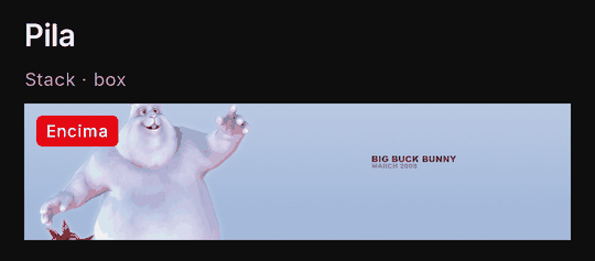
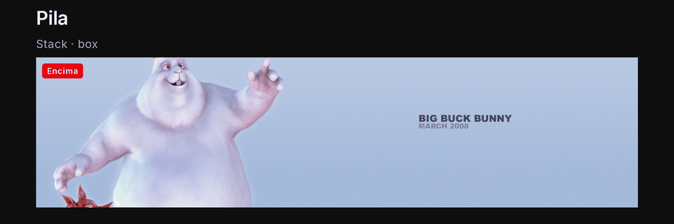
Children laid on each other, the first at the back: a badge over a picture, a label over a banner. A child without
positioned starts at the top start corner; use margin and padding to move one.
| Property | Type | Default | Per size | Notes |
|---|---|---|---|---|
children |
nodes (laid on each other, first at the back)[] | none | no | its children, drawn in order |
{ "type": "Stack", "children": [
  { "type": "Image", "url": "https://peach.blender.org/wp-content/uploads/title_anouncement.jpg", "aspect": "banner", "alt": "Big Buck Bunny" },
  { "type": "Badge", "text": "Nuevo", "textEn": "New", "margin": 8 }
] }
export async function screen() {
  return { type: "Stack", children: [
    { type: "Image", url: "https://peach.blender.org/wp-content/uploads/title_anouncement.jpg", aspect: "banner", alt: "Big Buck Bunny" },
    { type: "Badge", text: "4K", margin: 8 },
  ] };
}
- TV: only a focusable child takes focus; the stack itself takes it when it has an
onTap. - Phone and TV: the same.
- Limits and mistakes: no
alignSelf; aStackis a container cell in a twelve-column row (it stretches to its line).
Positioned children (Stack)
Flutter's Positioned, as a style property of a Stack's child: positioned: { top?, left?, right?, bottom?, width?,
height? }, each a number of dp (0 to 1280, clamped) or a share of the stack written "25%" (0% to 100%). With left
and right (or top and bottom) the child takes the room between them; a width (height) given too is ignored,
logged. A child without positioned keeps the stack's alignment and sizes the stack; a stack whose children are all
positioned takes the width it is offered and its own height (or minHeight; without one it is 0 tall: give it one).
Children are drawn in their order (a later one over an earlier one) and the focus walks them in that order; everything is
clipped to the stack and kept inside it, so nothing is pressed outside it. On any other node positioned is ignored,
logged. Per size like every style property.
{ "type": "Stack", "height": 200, "children": [
  { "type": "Image", "url": "https://img.example.com/cover.jpg", "fill": true, "height": 200 },
  { "type": "Badge", "text": "EN VIVO", "textEn": "LIVE", "color": "error", "positioned": { "top": 8, "right": 8 } },
  { "type": "Text", "text": "Final de la copa", "textEn": "Cup final", "style": "h4", "positioned": { "left": 12, "right": 12, "bottom": 12 } }
] }
Spacer and SizedBox
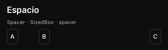
Empty space. SizedBox is an empty box of its width and height (on the size scale); Spacer is an empty box that
takes its flex share of a Row or Column, pushing what follows to the end. Both are the same older node, spacer.

| Property | Type | Default | Per size | Notes |
|---|---|---|---|---|
| (none) | SizedBox is an empty box of its width/height; Spacer takes its flex share of a Row or Column |
{ "type": "Row", "children": [
  { "type": "Text", "text": "A" },
  { "type": "SizedBox", "width": 48 },
  { "type": "Text", "text": "B" },
  { "type": "Spacer", "flex": 1 },
  { "type": "Text", "text": "C" }
] }
export async function screen() {
  return { type: "Row", children: [{ type: "Text", text: "Título" }, { type: "Spacer", flex: 1 }, { type: "Badge", text: "3" }] };
}
- TV: never focused.
- Phone and TV: the same; prefer
gapon the parent over spacers between every child. - Limits and mistakes:
widthandheightonly take the size scale (16 to 640); a value off it drops the node.
Swipe: onSwipeLeft and onSwipeRight
Any node can answer a sideways swipe, with one action each (the same shapes as onTap). The direction is the finger's: a swipe to the left is "the next page", to the right "the previous one" (the pages node's own turn follows the same rule). A drag of at least 64 dp counts; a vertical scroll is never read as one, and a node that scrolls sideways keeps its own scroll.
On the TV there is no finger: onSwipeLeft answers Right and onSwipeRight answers Left, but only once focus has nowhere further to go that way, so a remote still moves between buttons first. Keep a button for the same step (swipe is a shortcut, not the only way: an older Kino ignores both properties, and a screen reader uses the buttons).
export async function screen({ state }) {
  const page = state.page ?? 0;
  return { type: "Column", key: "reader", flex: 1, onSwipeLeft: "next", onSwipeRight: "prev",
    children: [{ type: "Text", text: state.pages[page] }, { type: "Row", children: [
      { type: "IconButton", icon: "arrow_back", labelText: "Anterior", onPressed: "prev" },
      { type: "IconButton", icon: "arrow_forward", labelText: "Siguiente", onPressed: "next" } ] }] };
}
Divider
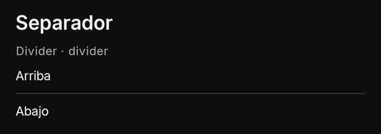
A thin rule across its parent: between groups of a column, under a heading.

| Property | Type | Default | Per size | Notes |
|---|---|---|---|---|
| (none) | a thin rule across its parent |
{ "type": "Column", "gap": 8, "children": [
  { "type": "Text", "text": "Arriba", "textEn": "Above" },
  { "type": "Divider" },
  { "type": "Text", "text": "Abajo", "textEn": "Below" }
] }
export async function screen() {
  return { type: "Column", gap: 8, children: [{ type: "Text", text: "Uno" }, { type: "Divider" }, { type: "Text", text: "Dos" }] };
}
- TV: never focused. Phone and TV: the same. Mistakes: a divider in a
Rowdraws nothing useful (it is horizontal).
Scroll (SingleChildScrollView)
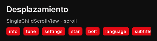
Its children, scrolling: vertical (the default) for a long page, horizontal for a strip of chips or badges. Most
screens put everything under the fixed parts (a TabBar) in one vertical scroll with flex: 1.

A reader (manga, webtoon, comics, a long article) adds two things: zoom (pinch, double tap and drag; the content is laid
out wider, so a picture with fit: "width" stays sharp and gets taller) and onScroll (where the person stopped, from 0 to
1, to show "42 %" or to save the place). Both are additive: no new apiVersion, an older Kino ignores them. See the recipe
A reader.
{ "type": "SingleChildScrollView", "key": "chapter", "flex": 1, "zoom": true, "onScroll": "scrolled",
  "children": [{ "type": "Image", "url": "https://example.com/p1.jpg", "fit": "width" }] }
| Property | Type | Default | Per size | Notes |
|---|---|---|---|---|
children |
nodes[] | none | no | its children, drawn in order |
direction |
vertical | horizontal |
vertical |
yes | a ListView or rail inside a scroll of the same direction is drawn all at once |
zoom |
true | { max } |
none | yes | a vertical scroll the person can pinch or double-tap to zoom (to 4x, or max from 1.5 to 8) and drag once zoomed; the content is laid out wider, so a fit: "width" picture stays sharp; ignored on a sideways scroll |
onScroll |
action | none | no | its event's value is the settled position from 0 (top) to 1 (end), sent 0.3 s after the person stops scrolling; a vertical scroll that scrolls itself |
{ "type": "Column", "children": [
  { "type": "TabBar", "key": "tabs", "tabs": [{ "value": "a", "label": "Uno", "labelEn": "One" }, { "value": "b", "label": "Dos", "labelEn": "Two" }], "onChanged": "tab" },
  { "type": "SingleChildScrollView", "flex": 1, "children": [{ "type": "Column", "padding": 16, "gap": 12, "children": [
    { "type": "Text", "text": "Una página larga", "textEn": "A long page" }
  ] }] }
] }
export async function screen() {
  const badges = ["Acción", "Drama", "Comedia", "Terror"].map((text) => ({ type: "Badge", text }));
  return { type: "SingleChildScrollView", direction: "horizontal", children: [{ type: "Row", gap: 8, children: badges }] };
}
- TV: the scroll follows the focus: moving onto a node off screen brings it into view, scrolling only as much as it
needs (with a small margin); a node already in view never scrolls the rest under a header. Up (Down) moves focus only
to a focusable that already shows that way; when none shows yet, the
Scrollscrolls by 80% of its height instead, press after press, until one shows (then the next press moves there) or its start (end) is reached. So a block with nothing focusable (a status card, a caption, a table) between two focusables, above the first or below the last is always read on the way, never scrolled past unseen; where the next focusable is on screen (a dense list) focus moves at once, with no paging. Only at the start (end) does the key leave theScroll: in aScaffoldbody Up then reaches theAppBar's picked tab; Down at the end does nothing (never wraps round to the top). Down from theAppBaralways enters the body: its nearest focusable takes focus and scrolls into view, wherever the body was left; a body with nothing focusable (text, cards, tables) pages instead. A press always scrolls or moves focus, until there is nothing left that way. The same in a player panel's body. A block the remote should rest on can say so withcanRequestFocus: true. - Phone and TV: a touch drag on the phone; the D-pad on the TV.
- Limits and mistakes: a
ListViewor a rail inside a scroll of the same direction is drawn all at once (no laziness) and capped at 60 titles; a table cell never holds a scroll.
GridView
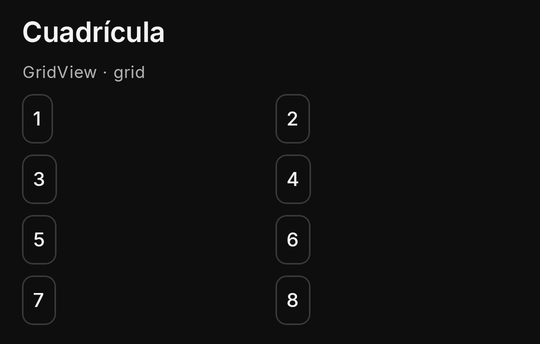
Its children in equal columns, filled row by row: a grid of small tiles where every cell is the same width. For cards
that change count by size, prefer the twelve-column row or per-size columns.
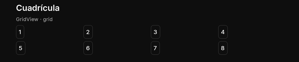
| Property | Type | Default | Per size | Notes |
|---|---|---|---|---|
children |
nodes[] | none | no | its children, drawn in order |
columns |
1 to 8 | 2 |
yes | equal columns, filled row by row |
{ "type": "GridView", "columns": { "compact": 2, "medium": 3, "expanded": 4 }, "gap": 8, "children": [
  { "type": "Card", "children": [{ "type": "Text", "text": "1" }] },
  { "type": "Card", "children": [{ "type": "Text", "text": "2" }] },
  { "type": "Card", "children": [{ "type": "Text", "text": "3" }] }
] }
export async function screen() {
  const tiles = Array.from({ length: 8 }, (_, i) => ({ type: "Card", children: [{ type: "Text", text: String(i + 1) }] }));
  return { type: "GridView", columns: { compact: 2, expanded: 4 }, gap: 8, children: tiles };
}
- TV: the D-pad moves cell by cell. Phone and TV: per-size
columnsis the usual way to fit both. - Limits and mistakes:
columns1 to 8; aGridViewis not lazy: for hundreds of items use aListViewwithcolumns.
ListView
A lazy list of items (nodes), drawn as they scroll into view: the way to show long feeds. empty is what shows when
there are no items; columns makes it a grid; onEndReached asks your plugin for more.
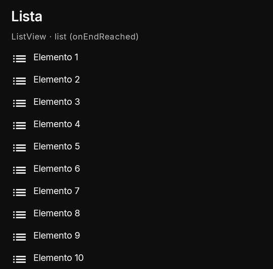
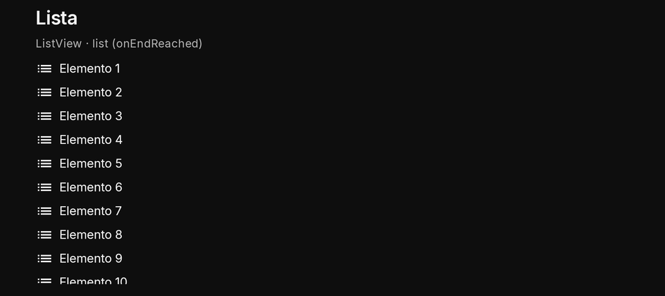
| Property | Type | Default | Per size | Notes |
|---|---|---|---|---|
items |
nodes[] | none | no | at most 500, each with a key of its own; drawn lazily |
empty |
node | none | no | drawn when there are no items |
columns |
1 to 8 | 1 |
yes | a grid of items |
stickToBottom |
boolean | false |
yes | opens at the last item and follows new ones while the person is at the end; one column, in a list that scrolls itself (layout fill) |
newItemsHint |
boolean | false |
no | items appended while the person reads higher up show Kino's own «↓ Nuevos» chip (its text, never yours); a tap goes to the end (new items) |
onEndReached |
{ event, arg? } |
none | no | sent once when the last item comes into view, again only after your answer drew a longer list (or loadingMore went from true to false); never more than once a second |
loadingMore |
boolean | false |
no | true draws Kino's spinner after the items |
done |
boolean | false |
no | true stops asking for more |
{ "type": "ListView", "key": "feed", "onEndReached": { "event": "more" }, "loadingMore": false, "done": false,
  "empty": { "type": "emptyState", "title": "Sin elementos", "titleEn": "No items" },
  "items": [
    { "type": "Text", "key": "i1", "text": "Elemento 1", "textEn": "Item 1" },
    { "type": "Text", "key": "i2", "text": "Elemento 2", "textEn": "Item 2" }
  ] }
export async function screen({ state }) {
  const n = Number.isInteger(state.count) ? state.count : 10;
  const items = Array.from({ length: n }, (_, i) => ({ type: "Text", key: "row" + i, text: "Elemento " + (i + 1) }));
  return { type: "ListView", key: "feed", items, onEndReached: { event: "more" }, loadingMore: state.loading === true, done: n >= 100 };
}

export async function screenEvent({ name, state }) {
  if (name === "more") return { state: { count: Math.min(100, (state.count || 10) + 10) } };
  return null;
}
- TV:
onEndReachedfires when the last item comes into view, as on the phone. - Phone and TV: the same lazy list. With
stickToBottom: trueit opens at its last item and a new last item scrolls into view while the person is at the end (or one item from it); once they scroll up it stays put until they come back down (a chat: see the player panel's layout fill). It needs a list that scrolls itself: one column, in a full screen or in a panel withlayout: "fill". Drawn flat (a panel's default scroll layout, inside aSingleChildScrollView) it does nothing, logged once. - Limits and mistakes: 500 items; each item needs a
keyof its own.onEndReachedcomes again only after your answer drew a longer list orloadingMorewent from true to false, at most once a second, never while the screen is hidden. A timer that turnsloadingMoreoff on every tick with nothing new makes Kino ask once per tick.
New items (newItemsHint)
With newItemsHint: true, items appended while the person reads higher up (the old last item still in the list) show
Kino's own small chip over the list's bottom, «↓ Nuevos» / «↓ New»: Kino's text, never yours. A tap goes to the end and
the chip hides as soon as the end shows. Beside stickToBottom the chip only shows once the person scrolled up: at the
end the list follows the new item itself. It needs a list that scrolls itself (one column); a grid or a flat list draws
no chip.
{ "type": "ListView", "key": "chat", "flex": 1, "stickToBottom": true, "newItemsHint": true,
  "items": [{ "type": "Text", "key": "m1", "text": "Hola", "textEn": "Hi" }] }
- TV: the chip is a focus stop: Down from the list region (a list whose items take no focus holds focus itself) reaches it before the controls under the list; OK goes to the end.
TabBar
A row of tabs: the top-level switch of a multi-part screen. It is not an input: its value is not in state.inputs.
Keep the chosen tab in your own state from its onChanged event, and draw the matching body.
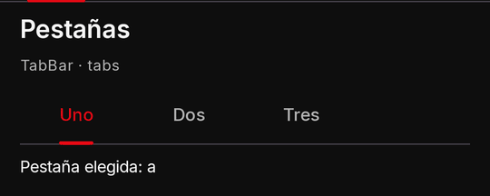

| Property | Type | Default | Per size | Notes |
|---|---|---|---|---|
tabs |
{ value, label, labelEn?, badge? }[] |
required | no | 1 to 500; a tab's badge sits beside its label (shared properties) |
value |
string | the first tab | no | the selected tab; NOT in state.inputs: keep it in your state from onChanged |
onChanged |
action | none | no | its event's value is the tab's value |
divider |
boolean | true |
no | additive, no new apiVersion: false takes away the line under the tabs |
On a TV the tabs are text with a line under the picked one (not pills).
{ "type": "TabBar", "key": "section", "value": "news", "onChanged": "tab", "tabs": [
  { "value": "news", "label": "Noticias", "labelEn": "News" },
  { "value": "config", "label": "Configuración", "labelEn": "Settings" }
] }
export async function screen({ state }) {
  const tab = state.tab === "config" ? "config" : "news";
  return { type: "Column", children: [
    { type: "TabBar", key: "section", value: tab, onChanged: "tab", tabs: [{ value: "news", label: "Noticias" }, { value: "config", label: "Ajustes" }] },
    { type: "Text", text: tab === "news" ? "Las noticias" : "Los ajustes", padding: 16 },
  ] };
}

export async function screenEvent({ name, value }) {
  return name === "tab" ? { state: { tab: value } } : null;
}
- TV: Left and Right walk the tabs; at the bar's end they go on to the next focusable beside it in the same row
(a refresh
IconButtonafter the tabs), and with nothing there they stay on the bar, never jumping to another row or Kino's title bar. Entering the bar, from above, below or beside, lands on the selected tab. The same forChips. - Phone and TV: a body under the screen's first
TabBar(anywhere: a headerRowtoo) that is aScroll, aListViewor a grid of titles with akeyof yours keeps its scroll per tab: keyed per tab (newsBody,settingsBody) or not, coming back to a tab finds it where the person left it. - Phone and TV: a row of tabs on both.
- Limits and mistakes: reading
state.inputs.<key>for a tab gives nothing; aTabBarwith no valid tab is dropped.
ExpansionTile (accordion)
Sections that open and close: frequently asked questions, advanced options. Toggling is Kino's (no call to your plugin);
which items are open lives in state.ui.open.<key>, so it survives a re-render. One at a time unless multiple.
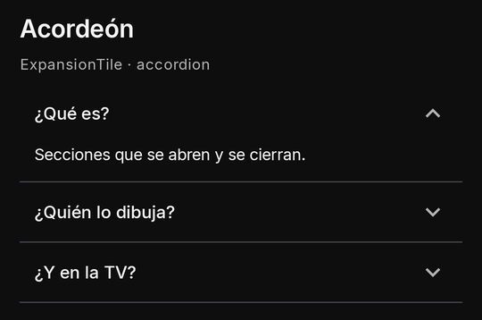
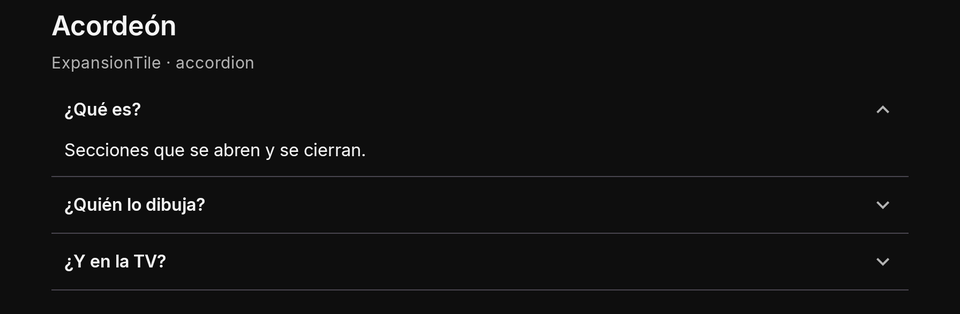
| Property | Type | Default | Per size | Notes |
|---|---|---|---|---|
key |
string | required | no | which items are open lives in state.ui.open.<key> |
items |
{ key, title, titleEn?, children?, open? }[] |
required | no | 1 to 500; open is only the first look |
multiple |
boolean | false |
no | several items open at once |
{ "type": "ExpansionTile", "key": "faq", "items": [
  { "key": "what", "title": "¿Qué es?", "titleEn": "What is it?", "open": true, "children": [{ "type": "Text", "text": "Una sección.", "textEn": "A section." }] },
  { "key": "how", "title": "¿Cómo funciona?", "titleEn": "How does it work?", "children": [{ "type": "Text", "text": "Se abre y se cierra.", "textEn": "It opens and closes." }] }
] }
export async function screen() {
  const faq = [["what", "¿Qué es?", "Una galería."], ["who", "¿Quién la dibuja?", "Kino."]];
  return { type: "ExpansionTile", key: "faq", items: faq.map(([key, title, text]) => ({ key, title, children: [{ type: "Text", text }] })) };
}
- TV: each header takes focus and OK toggles it; Down from an open header enters its content.
- Phone and TV: the same component.
- Limits and mistakes:
keyis required; items 1 to 500 with distinct keys; each header costs one node of the 600, and when the budget runs out the accordion keeps fewer items. Never in an answer's pop-up. A required field in a closed item does not keep a form's submit off, but the submit opens the item when it fails.
steps
A setup flow in Kino's own look, for any plugin with steps to walk through (sign in, a code, a password, done): each step
a header with Kino's numbered circle (a check once done). The current step is open, its children drawn under it (a
Form with a masked TextField, a QrImage...); a done step collapses to its subtitle (or Kino's «Listo»); a
pending one is dimmed. With onStepTap a done step is pressable, so the person can go back to it.
| Property | Type | Default | Per size | Notes |
|---|---|---|---|---|
items |
{ key, title, titleEn?, subtitle?, subtitleEn?, state, children? }[] |
required | no | 1 to 12; state done, current, pending; exactly one current (its children are drawn under it); a done one shows its subtitle (else Kino's «Listo») |
onStepTap |
event name or { event } |
none | no | a done step becomes pressable (touch, or OK on the TV): the event goes with the step's key as arg |
{ "type": "steps", "key": "login", "onStepTap": "goBack", "items": [
  { "key": "phone", "title": "Tu número", "titleEn": "Your number", "subtitle": "+57 300 •••• 12", "state": "done" },
  { "key": "code", "title": "Código", "titleEn": "Code", "state": "current", "children": [
    { "type": "Form", "key": "codeForm", "onSubmitted": "checkCode", "children": [
      { "type": "TextField", "key": "code", "kind": "number", "labelText": "Código", "required": true, "minLength": 5 },
      { "type": "ElevatedButton", "labelText": "Siguiente", "labelTextEn": "Next", "submit": true }
    ] }
  ] },
  { "key": "twofa", "title": "Contraseña", "titleEn": "Password", "state": "pending" }
] }
export async function screenEvent({ name, arg, state }) {
  if (name === "goBack") return { state: { step: arg } }; // arg: the done step's key
  if (name === "checkCode") return { state: { step: "twofa" } };
  return null;
}
- Phone and TV: the same flow. On the TV only a pressable done step and the current step's own fields take focus:
Down from a done step goes into the open step; OK on a done step sends
onStepTap. A screen reader reads each header as «Paso 2 de 3: Código, actual». - Limits and mistakes: 1 to 12 steps, each with a valid, distinct
keyand atitle. Exactly onecurrent: none while a step is still to do makes the first one not done current; two keep the first; an unknownstatereads aspending; children on a step that is not current are not drawn (all logged). Each header counts as one node of the tree's budget; the open step's children sit one level below the node.
Card
Kino's card around its children: plain (the default), outlined or filled. With flush: true the card has no
padding of its own and clips its children to its rounded shape, so an Image at its top runs edge to edge (pad the text
yourself). A card with an onTap is a press target as a whole.
Containers own their padding: one value on all sides, children add none. Without a padding of yours a card keeps
16 dp on every side of its content (24 on the TV) and its children 8 dp apart (12 on the TV); a padding or gap you
declare wins.
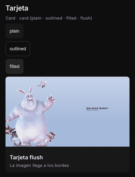
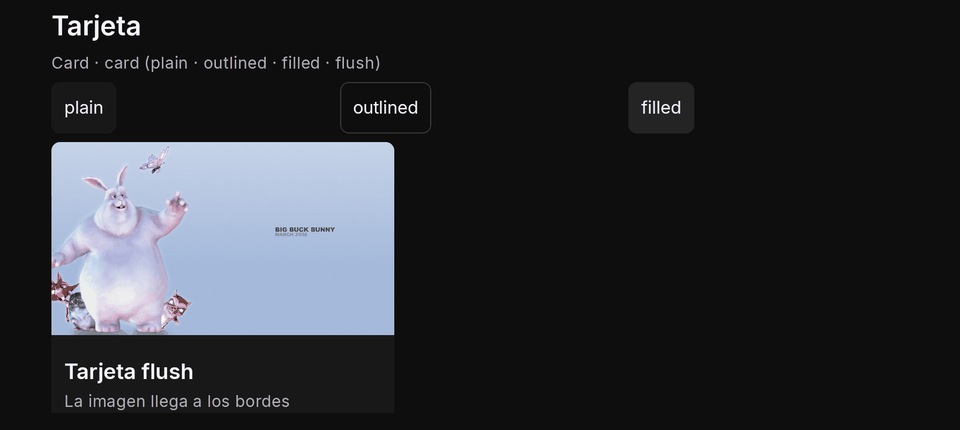
| Property | Type | Default | Per size | Notes |
|---|---|---|---|---|
children |
nodes[] | none | no | its children, drawn in order |
variant |
plain | outlined | filled |
plain |
yes | Kino's three card looks |
flush |
boolean | false |
yes | no padding of its own and its children clipped to its rounded shape: an Image at its top runs edge to edge |
{ "type": "Card", "key": "story", "flush": true, "onTap": { "event": "read", "arg": "story-1" }, "children": [
  { "type": "Image", "url": "https://peach.blender.org/wp-content/uploads/title_anouncement.jpg", "aspect": "16:9", "alt": "Big Buck Bunny" },
  { "type": "Column", "padding": 12, "gap": 4, "children": [
    { "type": "Text", "text": "Un titular", "textEn": "A headline", "style": "h4", "maxLines": 3 },
    { "type": "Text", "text": "La fuente", "textEn": "The source", "style": "caption", "color": "muted" }
  ] }
] }
export async function screen() {
  const card = (variant) => ({ type: "Card", variant, children: [{ type: "Text", text: variant }] });
  return { type: "Column", gap: 8, padding: 16, children: [card("plain"), card("outlined"), card("filled")] };
}
- TV: a card with an action takes focus with Kino's ring; one without is skipped.
- Phone and TV: the same look;
flushclips on both. - Limits and mistakes: with
flushthe card's ownpaddingis not used: pad its text children. A card is a container cell in a twelve-column row: it stretches to its line's height unless it has a fixedheight.
Scaffold
Flutter's Scaffold: the root of a screen or of a player panel with an appBar pinned at the top of your area, a body
in the height left, a floatingActionButton above a bottomNavigationBar at the bottom. Only as a result's root (a
nested one is dropped, logged); a result whose root is a Scaffold is drawn in layout: "fill" without asking (another
layout is ignored, logged). Its body is bounded: a ListView or a SingleChildScrollView in it scrolls itself while
the bars stay put, and the keyboard shrinks the body, never the bars. A scrolling body keeps room under its last line
(16 dp, 24 on the TV), so the end of a long text is never cut at the window's edge; on the TV, Down with nothing more to
focus pages the body (an opened ExpansionTile's text too) and, at its very end, stays put.
Kino's own title bar stays. Over every plugin screen Kino draws the bar with your plugin's name and Close (an X
alone; a screen reader says «Cerrar», «Close» in English); a Scaffold's AppBar sits under it, inside your area, and
never replaces or covers it (the person always knows whose screen this is and how to leave). In a player panel the
AppBar is compact (one 48 dp row). The bar owns one padding on all sides (16 dp; 24 on the TV, 16 in a panel) round its
title row and its bottom TabBar together, so the first tab lines up with the title and nothing touches the bar's edges;
a hairline marks its lower edge, so the body that scrolls under it never merges with it. On the TV the D-pad goes from
the AppBar's leading and actions to the body, then the bottom bar and the button; Up from the body's first stop
reaches the bar's bottom TabBar on its selected tab (with no bottom, its last action), never Kino's Close past it;
while the body can still scroll up, Up pages it first. Right past the last tab reaches the bar's actions in order (Left
past the first tab its leading), Down from an action goes back to the tabs, and Down from the tabs to the body. Back
closes or pops as everywhere. One exception to the two bars, yours to ask for: mergeWithKinoBar makes them one
bar, and one compact bar is the recommended setup.
| Property | Type | Default | Per size | Notes |
|---|---|---|---|---|
appBar |
an AppBar |
none | no | pinned at the top of your area, under Kino's own title bar (never replacing or covering it) |
body |
node | required | no | the bounded height left: a ListView or a scroll in it scrolls itself while the bars stay |
floatingActionButton |
a FloatingActionButton |
none | no | above the bottom bar |
bottomNavigationBar |
a NavigationBar |
none | no | at the bottom |
onBack |
action | none | no | apiVersion 19: Back sends this to you instead of leaving (Flutter's PopScope with canPop: false); no go; a failed or timed-out call, or a second Back meanwhile, closes the screen |
onBack is Flutter's PopScope with canPop: false (apiVersion 19). While the screen on show declares it, the system
Back (the phone's, the TV remote's) does not close the screen or pop a route: Kino sends you that action as the person's press
(the same shapes as onPressed: "event", { event, arg } or { ui: [...], event }, never a go) and you answer as usual.
When the next Back should leave, your next tree simply does not declare onBack. It never traps the person: an open pop-up
still closes first; a pushed route whose root declares it gets the Back instead of popping; if the call fails, times out or
its answer is invalid the screen closes; a second Back while the first call is still running closes it too; Kino's own Close
is unaffected. A player panel has no Back to hold and ignores it (logged). See the recipe
A search view that Back closes first.
See the recipe A screen with an app bar, tabs and a floating button.
AppBar
Only a Scaffold's appBar (anywhere else dropped, logged): a row with a leading IconButton, the title (read as a
heading by a screen reader) and up to four actions IconButtons (the rest dropped, logged; each needs a labelText,
what a screen reader says, and may carry a badge), then an optional bottom TabBar. backgroundColor is a colour
role, elevation Kino's shadow. A bar without a title is a row of buttons.
title is a string or any node (Flutter's way): a string is a Text read as the heading (titleEn its twin); a
node (a TabBar, a Row of buttons, an Image, a Text with its own style; at most 40 nodes, else dropped, logged;
localize its texts yourself) takes the room left of the actions in the same row: a TabBar there scrolls sideways
when it overflows, and on the TV its tabs and the actions are one row for the D-pad (Right past the last tab reaches the
first action, Up from the body lands on the selected tab). bottom stays for the classic second row. See
Tabs in the app bar.
A logo instead of the name: with mergeWithKinoBar the bar is the plugin's, so an Image as the title (a data:image/png;base64,… of your logo, fit: "contain", h: 32, an aspect of the picture's own, and a Text as its fallback for a Kino that cannot read it) puts your logo where the name was. Paint the picture on the bar's own colour (an opaque PNG): a transparent one shows the app theme's fill behind it.
| Property | Type | Default | Per size | Notes |
|---|---|---|---|---|
title |
string or a node | none | no | a string (titleEn its twin) is read as a heading; or, Flutter's way, any node (a TabBar, a Row of buttons...; at most 40 nodes) in the room left of the actions |
leading |
an IconButton |
none | no | with a labelText (back, a menu) |
actions |
IconButton[] |
none | no | at most 4, each with a labelText; a badge allowed |
bottom |
a TabBar |
none | no | under the row |
centerTitle |
boolean | false |
no | the title centred |
dense |
boolean | false |
no | additive, no new apiVersion: on a phone the bar has 4 dp above and below its row instead of 16 (a TV has 8 dp instead of 24; a player panel keeps its own); also the one bar of mergeWithKinoBar |
divider |
boolean | true |
no | additive, no new apiVersion: false takes away the hairline at the bar's lower edge |
backgroundColor |
a colour role | Kino's surface | no | its text and icons in the role's readable colour |
mergeWithKinoBar |
boolean | false |
no | apiVersion 19, the root Scaffold's only: with a leading, Kino draws one bar, your leading in Close's place and your title in your plugin's name's |
mergeWithKinoBar (apiVersion 19, opt-in, only on the root Scaffold's bar and only the boolean true): with a
leading IconButton, Kino draws ONE bar instead of two. Your leading takes the place of Kino's Close (its press is your
action; its labelText is what a screen reader says), your title (titleEn too) the place of your plugin's name, your
actions stay at the end and Kino's own buttons (the plugin's bell) follow them; your plugin's name stays the bar's label for
a screen reader. Without a leading the flag is ignored (logged) and both bars show, as for every plugin that does not set
it. The person's way out is then your leading and the system Back (which closes the screen when onBack is absent or
fails), so give the leading a real exit ({ close: true }, or a back to the previous view). On the TV the same, the
leading first in D-pad order. A player panel ignores it (logged).
Recommended: one compact bar
Out of the box a plugin screen has two bars: Kino's own title bar (your plugin's name and Close) and, under it, your
AppBar. On a phone that is about 150 dp of header before the first line of content. The recommended setup for every screen
of a plugin is one compact bar: mergeWithKinoBar: true (one bar, your leading where Close was, your title where the
plugin's name was) plus dense: true (on a phone, 4 dp above and below the row instead of 16: 56 dp in all).
{ "type": "Scaffold",
  "appBar": { "type": "AppBar", "mergeWithKinoBar": true, "dense": true, "title": "Catálogo", "titleEn": "Catalog",
    "leading": { "type": "IconButton", "icon": "arrow_back", "labelText": "Atrás", "labelTextEn": "Back", "onPressed": { "event": "back" } },
    "actions": [{ "type": "IconButton", "icon": "search", "labelText": "Buscar", "labelTextEn": "Search", "onPressed": { "event": "search" } }] },
  "body": { "type": "SingleChildScrollView", "children": [] } }
What each window does with those two booleans:
| Where | mergeWithKinoBar |
dense |
|---|---|---|
| Phone | one bar: your leading, your title, your actions and Kino's own buttons (the bell) at the end |
the row has 4 dp above and below (56 dp) |
| TV | the same one bar, your leading first in D-pad order |
ignored: the TV keeps its 24 dp, the focus ring needs the room |
| Player panel | ignored (logged) | ignored: a panel's bar is already one compact 48 dp row |
Both are plain booleans, not per-size maps. To choose by window, build the tree from ctx.device and ctx.size (the
per-size values section): for example the merged bar everywhere, and dense only where
ctx.size is compact.
- Give the
leadinga real exit on every screen:{ close: true }on the front page, a back to the previous view everywhere else. With the two bars merged it is the only visible way out besides the system Back. - Set both on every screen of the plugin, not only one: a front page with two bars and a detail page with one looks like a bug.
denseonly changes the padding; the title, the actions and abottomTabBar are drawn as always.denseis additive (no newapiVersion): a Kino that does not know it draws the bar at its normal height.
NavigationBar
Only a Scaffold's bottomNavigationBar (anywhere else dropped, logged): 2 to 5 items ({ key, icon, label,
labelEn?, badge? }; more are dropped, fewer than two drop the bar, both logged). A phone draws Material's navigation
bar, a TV a bottom row of focusable items with Kino's ring. A press on another item sends onChanged with the item's
key as value; like a TabBar's, the picked item is not in state.inputs: keep it in your state and draw the
matching body.
| Property | Type | Default | Per size | Notes |
|---|---|---|---|---|
items |
{ key, icon, label, labelEn?, badge? }[] |
required | no | 2 to 5, keys distinct |
value |
string | the first item | no | the picked item's key (or selectedIndex); NOT in state.inputs: keep it in your state from onChanged |
selectedIndex |
integer | none | no | the picked item by its place, when there is no value |
onChanged |
action | none | no | its event's value is the item's key |
PageView (and the carousel)
Flutter's PageView: its children are pages, swiped across on a phone; on a TV Left and Right at a page's edge turn
the page (a page with nothing focusable leaves the pager itself as the stop). Kino draws the page dots under it and a
screen reader hears «Página 2 de 5». onPageChanged sends the settled page's index as value; initialPage is only the
first look (the page the person reached survives your re-renders). autoPlayMs (3,000 to 60,000) turns the page on its
own, paused while the person touches or focuses it and when the device's animations are off. viewportFraction below 1
is Kino's carousel: the neighbouring pages peek at the sides (padEnds: false starts the first page at the edge). Never
inside a sideways scroll or a table cell (dropped, logged); at most 24 pages.
| Property | Type | Default | Per size | Notes |
|---|---|---|---|---|
children |
nodes (the pages)[] | none | no | its children, drawn in order |
initialPage |
integer | 0 |
no | the first look only; past the last page, the last |
onPageChanged |
action | none | no | its event's value is the settled page's index |
autoPlayMs |
3,000 to 60,000 | none | no | turns the page on its own; paused while touched or focused and with animations off |
viewportFraction |
0.3 to 1 | 1 |
yes | below 1, Kino's carousel: the neighbouring pages peek |
padEnds |
boolean | true |
yes | the first and last pages centred in a carousel |
{ "type": "PageView", "key": "covers", "viewportFraction": 0.8, "autoPlayMs": 5000, "onPageChanged": "page", "children": [
  { "type": "Card", "flush": true, "children": [{ "type": "Image", "url": "https://img.example.com/1.jpg", "aspect": "16:9" }] },
  { "type": "Card", "flush": true, "children": [{ "type": "Image", "url": "https://img.example.com/2.jpg", "aspect": "16:9" }] }
] }
pages
Full-screen pages for a story to go through (apiVersion 17): Kino's own node, so it has no Flutter name; PageView stays the
carousel with dots. Put it as the root, or in a Column with flex: 1, which gives it the height left. Swiped on a phone and a
desktop. On a TV Left and Right move a page once nothing more is focusable that way inside it, Up and Down stay in it, and focus
goes into the new page; a page with nothing focusable still turns. On the first page Left does nothing: the plugin's area keeps
focus, as everywhere, and Back and Kino's close leave.
Kino draws the progress bar above the pages, one segment a page; you neither draw nor hide it. Nothing turns by itself. The page
reached lives in state.inputs.<key> as a number from 0 (it is no input: no label, no form rules), so it survives your
re-renders; a ui set or your state's inputs move it, and onPageChanged sends the settled index as value.
2 to 8 children (up to 250 with progress: "bar" or "none") and a key of your own, else the whole node is dropped,
logged. Never inside a sideways scroll, a table cell or another pages (dropped, logged). autoPlayMs, initialPage,
viewportFraction and padEnds are ignored, logged. For a chapter of a manga use reverse: true and progress: "bar" (see
the recipe A reader).
An older Kino drops the node: check kino.screen.widgets.includes("pages").
| Property | Type | Default | Per size | Notes |
|---|---|---|---|---|
children |
nodes (the pages, 2 to 8)[] | none | no | its children, drawn in order |
onPageChanged |
action | none | no | its event's value is the settled page's index |
progress |
segments | bar | none |
segments |
no | Kino's bar over the pages: one segment a page (up to 8 pages), one thin bar or none (up to 250 pages: a chapter, not a story) |
reverse |
boolean | false |
no | right to left, page 0 at the right: a swipe to the left turns to the next page, and on a TV so does Left (manga) |
{ "type": "pages", "key": "story", "onPageChanged": "page", "children": [
  { "type": "Column", "padding": 24, "children": [{ "type": "Text", "text": "47", "style": "hero" }] },
  { "type": "Column", "padding": 24, "children": [{ "type": "Text", "text": "Lo tuyo es la madrugada", "style": "h2" }] }
] }
ListTile
Flutter's ListTile: one row of a list in Material's heights (56 dp, 72 with a subtitle, 48 dense): a leading and
a trailing (one small node each: an Icon, a CircleAvatar, an Image, a Badge, a Text or a spinner; never
pressed themselves, their actions ignored, logged), the title and the subtitle. The whole tile is one press (onTap,
onLongPress) and, on the TV, one focus stop with Kino's ring (only with an onTap: a tile that does nothing never
rings). selected (with an onTap) fills it with Kino's primaryContainer and reads as selected.
| Property | Type | Default | Per size | Notes |
|---|---|---|---|---|
title |
string | required | no | titleEn; at most two lines |
subtitle |
string | none | no | subtitleEn; Kino's muted second line |
leading |
node | none | no | one of Icon, CircleAvatar, Image, Badge, Text, CircularProgressIndicator, never pressed itself |
trailing |
node | none | no | as leading, at the end |
dense |
boolean | false |
yes | a lower row (48 dp instead of 56, 72 with a subtitle) |
{ "type": "ListView", "items": [
  { "type": "ListTile", "key": "m1", "title": "María", "subtitle": "En línea", "subtitleEn": "Online", "onTap": "chat",
    "leading": { "type": "CircleAvatar", "text": "MA" }, "trailing": { "type": "Badge", "text": "2" } }
] }
Content
What the person reads and looks at.
Text
Plain text in one of Kino's styles. It never holds markup or links, keeps newlines and follows the app's reading
direction. Give every text its English twin (textEn): Kino picks by the person's language.
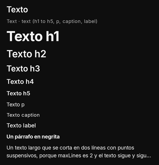
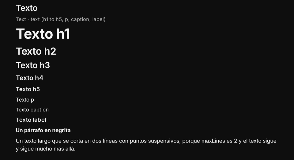
| Property | Type | Default | Per size | Notes |
|---|---|---|---|---|
text |
string | required (optional with time) |
no | 1 to 2,000 characters, plain (no markup, no links); newlines kept; with a time it is its prefix |
textEn |
string | none | no | the English twin, shown when the app is in English |
style |
hero | h1 | h2 | h3 | h4 | h5 | p | caption | label |
p |
yes | Kino's type scale (Text scale); display, title, subtitle, body read as h1, h3, h4, p |
maxLines |
integer ≥ 1 | none | yes | cut with an ellipsis |
bold |
boolean | false |
yes | headings are bold already; false never thins one |
time |
epoch ms | none | no | a whole number 0 to 253,402,300,799,999: Kino writes the time itself in the app's language (Text with a time) |
timeFormat |
relative | clock | countdown |
relative |
no | relative («hace 2 min», rewritten every 1 minute while shown, no call to you), clock («18:42», the device's 12/24 h) or countdown («0:42» left, every second, «0:00» once reached) |
{ "type": "Column", "gap": 4, "children": [
  { "type": "Text", "text": "Título", "textEn": "Title", "style": "h1" },
  { "type": "Text", "text": "Un párrafo que se corta en dos líneas.", "textEn": "A paragraph cut at two lines.", "maxLines": 2 },
  { "type": "Text", "text": "Importante", "textEn": "Important", "bold": true, "color": "warning" }
] }
export async function screen({ state }) {
  const name = typeof state.name === "string" ? state.name : "Ana";
  return { type: "Text", text: "Hola, " + name, textEn: "Hello, " + name, style: "h2", crossAxisAlignment: "center" };
}
- TV: never focused by itself (a text inside a pressable card goes with the card).
- Phone and TV: every style grows by 1.25 on the TV, so the order of the scale holds at ten feet; the person's font scale is respected on both.
- Limits and mistakes: at most 2,000 characters; an empty text is dropped. No font family, size, italic or free
colour: only
style,boldand a colour role.onPrimarynever reads on a surface: it falls back to the default (logged).
Text with a time
time (epoch ms) makes Kino write the time itself, in the app's language: timeFormat: "relative" (the default:
«ahora», «hace 2 min», «hace 3 h», «ayer», a date beyond; «en 5 min» for one ahead), rewritten once a minute while it
shows with no call to your plugin, "clock" («18:42», the device's 12 or 24 hour setting), or "countdown" (the wait
left, «0:42», «1:02:03», rewritten every second while it runs, «0:00» once reached). With a time the text is optional
and is its prefix. A time that is not a whole number from 0 is dropped (logged), and the text is then required again.
A pressable's enabledAt (a button, a FloatingActionButton, a card or a ListTile with onTap) draws it off until
that time on the device's clock and turns it on by itself, with no call to your plugin: «Reenviar» after a minute.
{ "type": "Row", "gap": 8, "children": [
  { "type": "TextButton", "labelText": "Reenviar código", "labelTextEn": "Send the code again", "enabledAt": 1761580860000, "onPressed": "resend" },
  { "type": "Text", "text": "en", "textEn": "in", "time": 1761580860000, "timeFormat": "countdown", "style": "caption" }
] }
{ "type": "Column", "children": [
  { "type": "Text", "text": "Actualizado", "textEn": "Updated", "style": "caption", "time": 1761580800000 },
  { "type": "Text", "time": 1761580800000, "timeFormat": "clock", "style": "caption", "color": "muted" }
] }
Text scale
style maps onto Kino's own type scale: on the phone h1 is the headline-large step down to p, the body-medium step;
caption is the small muted step and label the one buttons use. On the TV each step grows by 1.25. Headings are bold
already. The older names display, title, subtitle and body read as h1, h3, h4 and p; an unknown style is
p (logged).
hero (apiVersion 17) is one step above h1, for a big number: 72 sp with a 72 sp line on the phone, 90 sp on the TV, bold.
A Kino from before apiVersion 17 does not know it and draws p, so check the API version when the size matters.
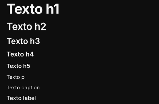
{ "type": "Column", "gap": 4, "children": [
  { "type": "Text", "text": "h1", "style": "h1" }, { "type": "Text", "text": "h2", "style": "h2" },
  { "type": "Text", "text": "h3", "style": "h3" }, { "type": "Text", "text": "h4", "style": "h4" },
  { "type": "Text", "text": "h5", "style": "h5" }, { "type": "Text", "text": "p", "style": "p" },
  { "type": "Text", "text": "caption", "style": "caption" }, { "type": "Text", "text": "label", "style": "label" }
] }
Colours
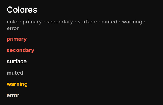
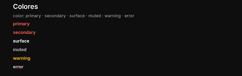
color takes a role, never a value: primary, secondary, surface, muted, warning, error, onPrimary,
primaryContainer and surfaceVariant, painted with Kino's palette (your manifest's theme tints primary where it
passes the contrast rules). A role that would not read on its surface is nudged toward the surface's own text colour
until it does (4.5:1). On a Text it colours the text; on a container (a Stack, a fallback) it is the fill.
{ "type": "Column", "gap": 4, "children": [
  { "type": "Text", "text": "primary", "color": "primary" },
  { "type": "Text", "text": "muted", "color": "muted" },
  { "type": "Text", "text": "warning", "color": "warning" },
  { "type": "Text", "text": "error", "color": "error" }
] }
- Mistakes: a hex value (
"#ff0000") is off the role list and is dropped. UseMaterialBanneror a toast'srolefor the success colour (successis a role of those, not ofcolor). A word Kino recognises gets the closest role named in its log line, the same in the app and the kit:screen: text color "success" is not a color role ("success" is a banner and toast role; the closest color role is "primary"), dropped(alsoinfo→secondary,danger→error,grey→muted, a role in other capitals → that role).
The two container roles are for a box that stands out without a banner: primaryContainer (Kino's surface tinted with
the primary; a manifest theme tints it as it tints primary) and surfaceVariant (Kino's raised surface). On a box
(Card, Column, Row, Stack) they are its fill, and its text and icons take the matching on-colour by themselves;
on a Text or an Icon they are the colour, nudged to read like every role. A chat's own bubble, three quarters wide at
most, its tail corner small:
{ "type": "Column", "crossAxisAlignment": "end", "fill": true, "children": [
  { "type": "Card", "key": "mine", "color": "primaryContainer", "maxWidthFraction": 0.75,
    "borderRadius": { "topStart": "large", "topEnd": "large", "bottomStart": "large", "bottomEnd": "small" },
    "children": [{ "type": "Text", "text": "Ya llegué", "textEn": "I'm here" }] }
] }
Image
A picture from a public https address (no host declaration needed, as for every image in Kino). aspect fixes the box's
shape; fallback is one node drawn in that box when the picture fails or there is no url, so a broken feed never
shows a hole.
| Property | Type | Default | Per size | Notes |
|---|---|---|---|---|
url |
https URL | required without fallback |
no | a public https host (no declaration needed), or data:image/png\|jpeg\|webp\|gif;base64,… of at most 200,000 characters (a picture you hold yourself, such as a book's cover; never svg; an older Kino draws the fallback); with a fallback, no url draws the fallback (an empty or refused one too, logged) |
alt |
string | none | no | what a screen reader says (altEn the English one) |
aspect |
16:9 | 2:3 | 1:1 | banner | w:h |
the picture's own | yes | the box's shape; w:h is any width over height from 0.2 to 5, like 1.4:1 or 900:1300 |
fit |
cover | contain | width |
cover |
yes | how the picture sits in its box: cover fills and crops, contain shows all of it, width takes the width and the picture's own height (the aspect, or 2:3, holds its place until it loads) |
focus |
top | center | bottom |
center |
yes | the part of the picture that stays when cover crops it |
headers |
{ Referer?, User-Agent? } |
none | no | the request headers the picture is asked with, for a site that answers only to its own page: only Referer (an https address) and User-Agent, each a text of up to 512 characters; sent only when the picture's host is in your manifest's hosts (and so is the Referer's); an older Kino asks without them (Pictures that need a Referer) |
fallback |
node | none | no | drawn in the image's box when the picture fails or there is no url: only Column, Row, Stack, Card, Spacer, Divider, Text, Icon, Badge, Skeleton, Image, at any depth, never pressed |
{ "type": "Image", "url": "https://kinotvapp.github.io/kino-plugins/missing-picture.png", "aspect": "16:9", "alt": "Sin imagen", "altEn": "No picture",
  "fallback": { "type": "Stack", "color": "surface", "children": [
    { "type": "Column", "padding": 12, "children": [{ "type": "Icon", "name": "movie" }, { "type": "Text", "text": "La fuente", "textEn": "The source", "style": "h3" }] }
  ] } }
export async function screen({ state }) {
  const picture = typeof state.picture === "string" && state.picture ? { url: state.picture } : {}; // no url at all: the fallback, no log line
  return { type: "Image", ...picture, aspect: "16:9", alt: "Póster", fallback: { type: "Text", text: "Sin imagen", textEn: "No picture", padding: 12 } };
}
fit decides how the picture sits in its box (additive, no new apiVersion; an older Kino reads every picture as cover):
cover fills the box and crops, contain shows all of it, and width takes the box's width and the picture's own height, so
a page or a long strip is never cut. With width the aspect (any w:h, like "1.4:1") only holds the place until the
picture loads. focus (top, center, bottom) picks the part that stays when cover crops.
Pictures that need a Referer
Next Kino release, not published yet
headers is additive (no new apiVersion) and arrives with the next Kino release. An older Kino asks for the picture
without them, so on it a site that needs them still answers 403 and the fallback draws.
Some sites (manga readers above all) serve their pictures only to a request that comes from their own page, with a browser
User-Agent, and answer 403 to anything else: the cover and the pages stay grey. Give the Image the headers the site wants:
{ "type": "Image", "url": "https://img.mangasite.example/p/12/001.jpg", "fit": "width", "aspect": "2:3",
  "headers": { "Referer": "https://mangasite.example/", "User-Agent": "Mozilla/5.0 (Linux; Android 14) AppleWebKit/537.36 Chrome/126 Mobile Safari/537.36" } }
{ "hosts": ["mangasite.example", "*.mangasite.example"] }
- Only two names.
Referer(an https address) andUser-Agent(in any case), each a text of 1 to 512 characters with no control character. Anything else is dropped and logged. - Only to your declared hosts. They are sent only when the picture's host is one of your manifest's
hosts(a*.example.compattern counts), and theRefereronly when its own host is declared too (otherwise theRefereralone is left out): a plugin cannot make Kino present a forged page to a site it never named. A picture from an undeclared public host still loads, without your headers. - An https
url. Adata:picture takes no headers. Without aUser-AgentKino sendsKino/<version>. - Kino downloads it. The picture still downloads in Kino (cached, four at a time), not through your code, so there is no size limit besides the image cache's.
-
Not per size. One
headersobject for every size. -
TV: an image is not focused unless it (or what holds it) has an action.
- Phone and TV: the same.
- Limits and mistakes:
http://and private addresses are refused (without a fallback the node is dropped; with one the fallback draws, and aurlthat is present but empty or refused is logged: leaveurlout when there is none). The fallback takes only simple nodes (Column,Row,Stack,Card,Spacer,SizedBox,Divider,Text,Icon,Badge,Skeleton,Image) and nothing in it is pressed. Without a fallback a failed picture shows Kino's mark.
Icon
One of Kino's icons by name; color takes a role. The same names serve a button's icon (an IconButton too), a
menu item's, the empty and error states', the manifest's screen.icon and the player panel's panel.icon. They are
Material Symbols (outlined), drawn as vectors: crisp at any size, tinted by the colour role around them. An icon says
nothing to a screen reader: an IconButton is read by its labelText.

| Property | Type | Default | Per size | Notes |
|---|---|---|---|---|
name |
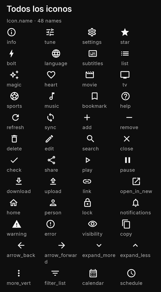
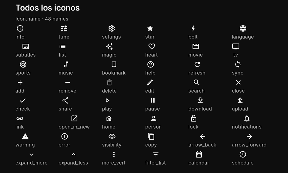
50 names | required | no | one of Kino's icons (the icon table): info, tune, settings, star, bolt, language, subtitles, list, magic, heart, movie, tv, sports, music, bookmark, help, refresh, sync, add, remove, delete, edit, search, close, check, share, play, pause, download, upload, link, open_in_new, home, person, lock, notifications, warning, error, visibility, copy, arrow_back, arrow_forward, expand_more, expand_less, more_vert, filter_list, calendar, schedule, send, mood; the last 34 from apiVersion 14 |
{ "type": "Row", "gap": 8, "children": [
  { "type": "Icon", "name": "star", "color": "primary" },
  { "type": "Icon", "name": "heart", "color": "error" },
  { "type": "Icon", "name": "movie" }
] }
export async function screen() {
  return { type: "Row", gap: 8, children: ["info", "star", "heart"].map((name) => ({ type: "Icon", name })) };
}
- Mistakes: a name off the list (
"replay", a Material icon name such as"Refresh") drops the node. Icons are not focusable. - apiVersion: the first sixteen names work from apiVersion 9 (the player panel's button); the rest arrived with
apiVersion 14. Screens need apiVersion 14, so a screen knows every name; a
panel.iconof the newer names in a plugin below apiVersion 14 is an unknown name (the button drawstune).
Icon names
Every name, what it shows, and since when. The gallery example draws them all, each with its name, in the «Todos los iconos» section of its Contenido tab.
| Name | What it shows | Since |
|---|---|---|
info |
information, details | apiVersion 9 |
tune |
options, adjustments (Kino's default) | apiVersion 9 |
settings |
settings | apiVersion 9 |
star |
a favourite, a rating | apiVersion 9 |
bolt |
quick, live, an action | apiVersion 9 |
language |
language, the web | apiVersion 9 |
subtitles |
subtitles, captions | apiVersion 9 |
list |
a list, an index | apiVersion 9 |
magic |
suggestions, something automatic | apiVersion 9 |
heart |
liked, saved | apiVersion 9 |
movie |
a film | apiVersion 9 |
tv |
a series, television | apiVersion 9 |
sports |
sport | apiVersion 9 |
music |
music, audio | apiVersion 9 |
bookmark |
saved for later | apiVersion 9 |
help |
help, a question | apiVersion 9 |
refresh |
refresh now (a circular arrow) | apiVersion 14 |
sync |
sync between devices | apiVersion 14 |
add |
add, new | apiVersion 14 |
remove |
remove one, less | apiVersion 14 |
delete |
delete (a bin) | apiVersion 14 |
edit |
edit (a pencil) | apiVersion 14 |
search |
search | apiVersion 14 |
close |
close, dismiss | apiVersion 14 |
check |
done, confirmed | apiVersion 14 |
share |
share | apiVersion 14 |
play |
play | apiVersion 14 |
pause |
pause | apiVersion 14 |
download |
download | apiVersion 14 |
upload |
upload, send a file | apiVersion 14 |
link |
a link | apiVersion 14 |
open_in_new |
opens outside (a link that leaves) | apiVersion 14 |
home |
home, the start | apiVersion 14 |
person |
a person, an account | apiVersion 14 |
lock |
locked, private | apiVersion 14 |
notifications |
notifications, alerts | apiVersion 14 |
warning |
a warning (a triangle) | apiVersion 14 |
error |
an error (a circle with a mark) | apiVersion 14 |
visibility |
show, seen (an eye) | apiVersion 14 |
copy |
copy | apiVersion 14 |
arrow_back |
back, previous | apiVersion 14 |
arrow_forward |
forward, next | apiVersion 14 |
expand_more |
open, more (a chevron down) | apiVersion 14 |
expand_less |
close, less (a chevron up) | apiVersion 14 |
more_vert |
more actions (three dots) | apiVersion 14 |
filter_list |
filter | apiVersion 14 |
calendar |
a date, a calendar | apiVersion 14 |
schedule |
a time, scheduled (a clock) | apiVersion 14 |
send |
send a message (a paper plane) | apiVersion 14 |
mood |
a reaction, a feeling (a smiley) | apiVersion 14 |
{ "type": "ElevatedButton", "labelText": "Actualizar ahora", "labelTextEn": "Refresh now", "icon": "refresh", "onPressed": "refresh" }
Badge
A small label: a count, a quality tag, "Nuevo".

| Property | Type | Default | Per size | Notes |
|---|---|---|---|---|
text |
string | required | no | a short label (textEn the English one) |
{ "type": "Row", "gap": 8, "children": [
  { "type": "Badge", "text": "Nuevo", "textEn": "New" },
  { "type": "Badge", "text": "HDR", "color": "warning" }
] }
export async function screen({ state }) {
  const unread = Number.isInteger(state.unread) ? state.unread : 3;
  return { type: "Row", gap: 8, children: [{ type: "Text", text: "Mensajes" }, { type: "Badge", text: String(unread) }] };
}
- Mistakes: an empty
textdrops it; a badge is not pressable on its own (put the action on its parent).
CircleAvatar
Flutter's CircleAvatar: a circle of radius dp in a colour role holding a picture (https, through Kino's own image
pipeline and host rules), else initials (at most three characters), else an icon (Kino's person by default). A picture
that fails shows the initials. It is always a circle: it takes no borderRadius (its radius is a number). A screen
reader says its labelText, else its initials.
| Property | Type | Default | Per size | Notes |
|---|---|---|---|---|
image |
https URL | none | no | a public https picture, through Kino's image pipeline; when it fails, the initials |
text |
string | none | no | initials, at most 3 characters (textEn) |
icon |
a Kino icon name | person |
no | without a picture or initials |
radius |
12 to 64 (dp) | 20 |
yes | always a circle: a CircleAvatar takes no borderRadius |
backgroundColor |
a colour role | primaryContainer |
no | its initials and icon in the role's readable colour |
labelText |
string | none | no | what a screen reader says (labelTextEn); else the initials |
{ "type": "Row", "gap": 8, "children": [
  { "type": "CircleAvatar", "image": "https://img.example.com/me.jpg", "text": "MA", "labelText": "María" },
  { "type": "CircleAvatar", "text": "JP", "backgroundColor": "secondary", "radius": 24 },
  { "type": "CircleAvatar", "icon": "person" }
] }
MaterialBanner
A line of news across the screen in Kino's colour for its role: an update, a warning, a failure with «Reintentar». It
may carry a title, one action button, and Kino's close when dismissible.
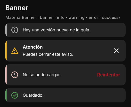
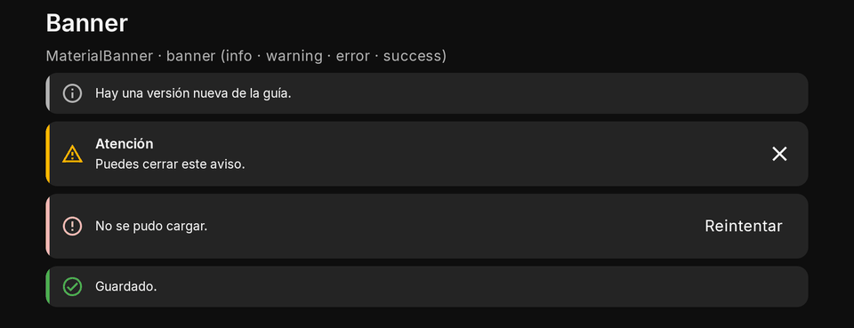
| Property | Type | Default | Per size | Notes |
|---|---|---|---|---|
text |
string | required | no | textEn |
role |
info | warning | error | success |
info |
no | Kino's colour and icon for it |
title |
string | none | no | titleEn |
action |
{ label, labelEn?, onTap } |
none | no | one button |
dismissible |
boolean | false |
no | Kino's close (needs a key of its own): hides it and sends the event dismiss with the key as arg |
{ "type": "Column", "gap": 8, "children": [
  { "type": "MaterialBanner", "role": "error", "text": "No se pudo cargar.", "textEn": "Could not load.", "action": { "label": "Reintentar", "labelEn": "Retry", "onTap": "retry" } },
  { "type": "MaterialBanner", "key": "tip", "role": "info", "title": "Consejo", "titleEn": "Tip", "text": "Puedes cerrar este aviso.", "textEn": "You can dismiss this notice.", "dismissible": true }
] }
export async function screen({ state }) {
  if (!state.failed) return { type: "Text", text: "Todo bien", textEn: "All good" };
  return { type: "MaterialBanner", role: "warning", text: "Sin conexión", textEn: "Offline", action: { label: "Reintentar", labelEn: "Retry", onTap: "retry" } };
}

export async function screenEvent({ name }) {
  if (name === "dismiss") return null; // a dismissible banner's close: arg is its key, Kino already hid it
  if (name === "retry") return { state: { failed: false } };
  return null;
}
- TV: the action and the close are focus stops in tree order.
- Phone and TV: full width on both.
- Limits and mistakes:
dismissibleneeds akeyof your own (a generated one is ignored, logged). The close hides it at once (state.ui.hidden) and sends the eventdismisswith the key asarg.
LinearProgressIndicator
A progress bar: value from 0 to 1, or none for an indeterminate one. A labelText sits beside it.
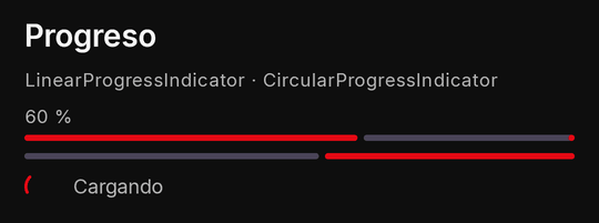

| Property | Type | Default | Per size | Notes |
|---|---|---|---|---|
value |
number 0 to 1 | none | no | none draws an indeterminate bar; outside 0..1 is clamped |
labelText |
string | none | no | a label beside the bar (labelTextEn) |
{ "type": "Column", "gap": 8, "children": [
  { "type": "LinearProgressIndicator", "value": 0.6, "labelText": "60 %" },
  { "type": "LinearProgressIndicator" }
] }
export async function screen({ state }) {
  const done = Number.isFinite(state.done) ? state.done : 0;
  return { type: "LinearProgressIndicator", value: Math.min(1, done / 10), labelText: done + " / 10" };
}
- Mistakes: a value outside 0..1 is clamped (logged); a non-number makes it indeterminate.
CircularProgressIndicator
Kino's spinner, with an optional line under it. While a screen waits for data, a Skeleton shaped like the
content reads better.


| Property | Type | Default | Per size | Notes |
|---|---|---|---|---|
text |
string | none | no | a line under Kino's spinner (textEn) |
{ "type": "CircularProgressIndicator", "text": "Cargando", "textEn": "Loading" }
export async function screen({ state }) {
  return state.ready ? { type: "Text", text: "Listo" } : { type: "CircularProgressIndicator", text: "Cargando", textEn: "Loading" };
}
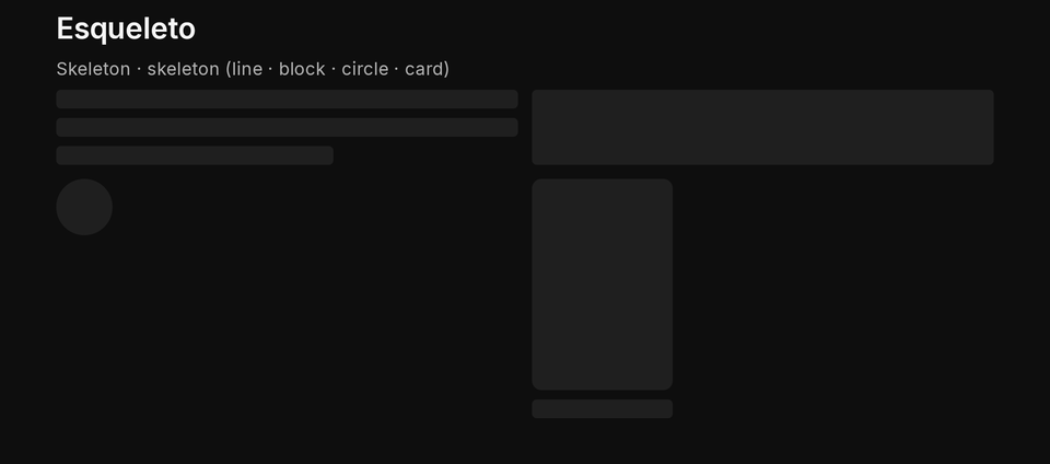
Skeleton
A placeholder while something loads, in Kino's muted colour, pulsing gently (still when the system's animations are
off), read as "Cargando…": line (1 to 6 bars), block, circle or card (a poster and its lines).
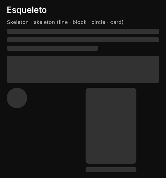
| Property | Type | Default | Per size | Notes |
|---|---|---|---|---|
shape |
line | block | circle | card |
line |
yes | size it with width/height |
lines |
1 to 6 | 1 |
yes | bars of a line |
{ "type": "Row", "gap": 12, "children": [
  { "type": "Skeleton", "shape": "circle", "width": 48, "height": 48 },
  { "type": "Skeleton", "shape": "line", "lines": 3, "flex": 1 }
] }
export async function screen({ state }) {
  if (!Array.isArray(state.items)) return { type: "Column", gap: 12, padding: 16, children: [1, 2, 3].map(() => ({ type: "Skeleton", shape: "card", width: 160 })) };
  return { type: "Column", children: state.items.slice(0, 50).map((t, i) => ({ type: "Text", key: "t" + i, text: String(t) })) };
}
- Mistakes:
linesabove 6 is lowered (logged). Size ablockwithheight, or it is a thin bar.
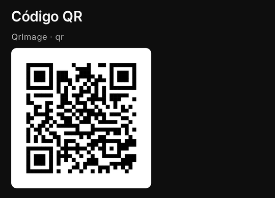
QrImage
A QR code Kino draws on the device (no network), black on white with its quiet zone: a link for a TV viewer to open on their phone, a room code to scan. Never pressed, never focused; it may sit in a pop-up.
| Property | Type | Default | Per size | Notes |
|---|---|---|---|---|
value |
string | required | no | 1 to 1,000 characters, drawn as written; a value holding one of your secrets is never drawn |
labelText |
string | none | no | what a screen reader says (labelTextEn) |
size |
small | medium | large |
medium |
yes | one of Kino's three sizes |
expiresInMs |
1,000 to 3,600,000 | none | no | the code stops working that long after Kino first draws this value: Kino counts it down under the code and dims it at zero (countdown) |
expiresAt |
epoch ms | none | no | the same as a time (the device's clock, read once), at most 3,600,000 ms away; ignored beside expiresInMs |
onExpire |
event name or { event, arg? } |
none | no | sent once per value: renew renewBeforeMs before the end, else expired at zero; value is { phase, remainingMs } |
renewBeforeMs |
1,000 to 3,600,000 | none | no | with onExpire: ask for a new code that long before the end (below the lifetime, else half of it) |
{ "type": "QrImage", "value": "https://kinotvapp.github.io/kino-plugins/", "size": "medium", "labelText": "Guía de plugins", "labelTextEn": "Plugin guide" }
export async function screen({ device }) {
  const link = "https://kinotvapp.github.io/kino-plugins/";
  return device === "tv"
    ? { type: "QrImage", value: link, size: "large", labelText: "Escanéalo con tu teléfono" }
    : { type: "ElevatedButton", labelText: "Abrir", onPressed: { go: { url: { href: link } } } };
}
- Phone and TV: the same picture; on a TV it is the way to hand over a link (a TV cannot scan:
kino.qr.scananswersunavailablethere). - Sizes:
small,mediumandlargeare 160, 200 and 240 dp on a phone and 180, 220 and 300 dp on a TV. On a TV a code is never taller than 30 % of the window, so on a 1280×720 TV (540 dp tall) every size is drawn at 162 dp: a step's header, the countdown and a button under the code still fit in view and the remote reaches them. A page that may still be taller than the window belongs in aSingleChildScrollView: the remote then walks it and Kino scrolls each focused item into view (aColumnroot does not scroll). - Limits and mistakes: 1 to 1,000 characters, drawn as written. Never build one from a secret: a value holding one of your sealed secrets is not drawn (Kino's empty state shows, logged).
A code that expires (expiresInMs, onExpire, renewBeforeMs)
A login code that stops working after a while (a messaging app's QR login, about 30 s) gets Kino's own countdown: a bar
and «Caduca en 23 s» under the code, ticked by Kino itself between your calls, and at zero the code dims under «Código
caducado». With onExpire Kino also asks you for a new code, once per code, without waiting for your every
timer:
{ "type": "QrImage", "value": "myapp://login?token=AbC", "size": "large", "labelText": "Escanéalo con la app",
  "expiresInMs": 30000, "renewBeforeMs": 5000, "onExpire": "newCode" }
export async function screenEvent({ name, value }) {
  if (name !== "newCode") return null; // value: { phase: "renew" | "expired", remainingMs }
  const token = "AbC" + Date.now(); // ask your service for a new token here
  return { state: { qr: "myapp://login?token=" + token } }; // a new value: a new countdown, the square keeps its size
}
- When the event goes: once per code value:
renewBeforeMsbefore the end (phase: "renew"), or at zero (phase: "expired") when there is no lead time. A slow answer leaves the old code counting down to its expired look; an answer that never comes is never asked again for that code (youreverytimer stays the fallback). A lead time not below the lifetime is cut to half of it (logged). - Clocks:
expiresInMscounts from when Kino first draws that value;expiresAt(epoch ms) is read against the device's clock once and then counted likeexpiresInMs, so a clock change later never moves it. Sending the same value again (a timer re-sendingexpiresInMs: 30000) never restarts its countdown; a new value always does. - Background, TV, secrets: the countdown keeps time while the screen is hidden, but the event waits: one that came
due goes once the screen shows again (
expiredif the end passed too). The code and its countdown never take focus. A code holding one of your secrets is never drawn, counted down or asked about. - Its answer is nobody's press: it keeps
state,toast,closeandconfig, as a timer's.
DataTable
A table in Kino's own look: TableRows holding TableCells. columns shares the width (flex), header makes the
first row the header, zebra stripes the rows; on a compact width the table scrolls sideways unless wrap.
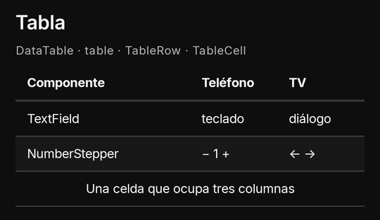
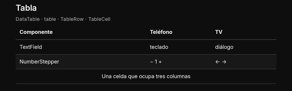
| Property | Type | Default | Per size | Notes |
|---|---|---|---|---|
children |
TableRow[] |
required | no | 1 to 200 rows |
columns |
{ key?, flex? }[] |
the widest row's count | yes | at most 20; each flex 1 to 12 |
header |
boolean | false |
yes | the first row is the header (bold, read as headings) |
wrap |
boolean | false |
yes | on a compact width, wrap instead of scrolling sideways |
zebra |
boolean | false |
yes | every other row on Kino's surface |
{ "type": "DataTable", "header": true, "zebra": true, "columns": [{ "flex": 2 }, { "flex": 1 }], "children": [
  { "type": "TableRow", "children": [{ "type": "TableCell", "text": "Plan" }, { "type": "TableCell", "text": "Precio", "textEn": "Price" }] },
  { "type": "TableRow", "children": [{ "type": "TableCell", "text": "Gratis", "textEn": "Free" }, { "type": "TableCell", "text": "0" }] },
  { "type": "TableRow", "key": "note", "children": [{ "type": "TableCell", "text": "Precios en dólares", "textEn": "Prices in dollars", "colSpan": 2, "crossAxisAlignment": "center" }] }
] }
export async function screen() {
  const rows = [["Lunes", "3"], ["Martes", "5"]].map(([day, n]) => ({ type: "TableRow", children: [{ type: "TableCell", text: day }, { type: "TableCell", text: n, crossAxisAlignment: "end" }] }));
  return { type: "DataTable", header: true, children: [{ type: "TableRow", children: [{ type: "TableCell", text: "Día" }, { type: "TableCell", text: "Vistos" }] }, ...rows] };
}
- TV: the table takes no focus; the D-pad walks only what is focusable inside its cells.
- Phone and TV: at least 96 dp a column when it scrolls sideways on a phone; a TV has room for the whole table.
- Limits and mistakes: 200 rows, 20 columns,
colSpan1 to 8. A row with fewer cells is padded; cells past the last column are dropped (logged). Each row and each cell costs one node. Cells never hold aListView, a scroll or another table.
TableRow
One row of a DataTable. Its key lets a ui show, hide or toggle name it (a row of details shown on demand).
| Property | Type | Default | Per size | Notes |
|---|---|---|---|---|
children |
TableCell[] |
none | no | at most 20; a short row is padded |
key |
string | none | no | lets show, hide, toggle name the row |
hidden |
boolean | false |
no | starts hidden; a required field in a hidden row is not checked |
TableCell
One cell: a plain text, or children (nodes one level below the table). colSpan and crossAxisAlignment may be
per-size maps (colSpan: { compact: 1, expanded: 3 }).
| Property | Type | Default | Per size | Notes |
|---|---|---|---|---|
text |
string | none | no | a plain cell (textEn); with a text the children are ignored |
children |
nodes[] | none | no | never ListView, SingleChildScrollView, DataTable at any depth |
colSpan |
1 to 8 | 1 |
yes | columns the cell covers |
crossAxisAlignment |
start | center | end |
start |
yes | its content across its width |
emptyState
Kino's empty state (an icon, a title and a line): a list with nothing in it, a search with no results. It is a Kino component: its name has no Flutter twin.
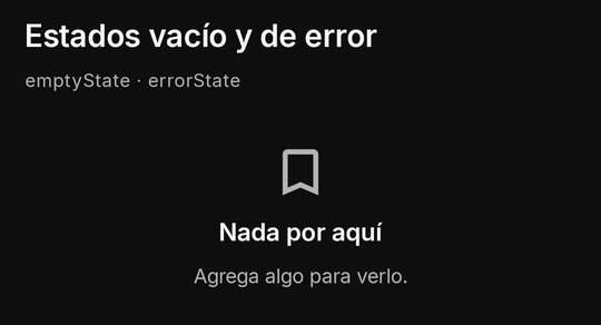
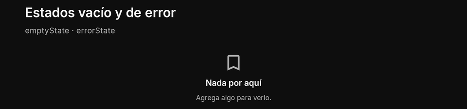
| Property | Type | Default | Per size | Notes |
|---|---|---|---|---|
title |
string | required | no | titleEn the English one |
text |
string | none | no | a line under the title (textEn) |
icon |
a Kino icon name | Kino's | no |
{ "type": "emptyState", "title": "Nada por aquí", "titleEn": "Nothing here", "text": "Agrega algo para verlo.", "textEn": "Add something to see it.", "icon": "bookmark" }
export async function screen({ state }) {
  const saved = Array.isArray(state.saved) ? state.saved : [];
  if (saved.length === 0) return { type: "emptyState", title: "Sin guardados", titleEn: "Nothing saved", icon: "bookmark" };
  return { type: "Column", children: saved.slice(0, 50).map((s, i) => ({ type: "Text", key: "s" + i, text: String(s) })) };
}
errorState
Kino's error state, the same shape as the empty one: a failed load with nothing to show. Pair it with a button to retry,
or show a MaterialBanner above the old data instead when there is some.
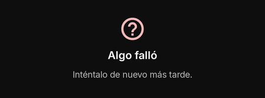

| Property | Type | Default | Per size | Notes |
|---|---|---|---|---|
title |
string | required | no | titleEn the English one |
text |
string | none | no | a line under the title (textEn) |
icon |
a Kino icon name | Kino's | no |
{ "type": "Column", "gap": 12, "crossAxisAlignment": "center", "children": [
  { "type": "errorState", "title": "Algo falló", "titleEn": "Something failed", "text": "Inténtalo de nuevo.", "textEn": "Try again." },
  { "type": "ElevatedButton", "labelText": "Reintentar", "labelTextEn": "Retry", "onPressed": "retry" }
] }
export async function screen() {
  return { type: "errorState", title: "Sin conexión", titleEn: "Offline", icon: "help" };
}
titleCard
One Home poster card for a KinoItem (the shape a home row returns). Its tap opens the title the way Home's card does,
with that very item, so «Continuar viendo», the saved lists and the progress know it. onTap may replace that with an
event, a go or ui operations; an item's open: { screen } starts your screen again instead.
| Property | Type | Default | Per size | Notes |
|---|---|---|---|---|
item |
KinoItem |
required | no | the shape a home row returns (id, ref, title, kind, poster...); a series needs your episodes capability |
size |
small | medium | large |
medium |
yes | one of Kino's three sizes |
{ "type": "titleCard", "size": "medium", "item": { "id": "bbb", "ref": "bbb", "title": "Big Buck Bunny", "kind": "movie", "year": 2008, "poster": "https://peach.blender.org/wp-content/uploads/title_anouncement.jpg" } }
export async function screen() {
  const item = { id: "bbb", ref: "bbb", title: "Big Buck Bunny", kind: "movie", poster: "https://peach.blender.org/wp-content/uploads/title_anouncement.jpg" };
  return { type: "titleCard", item, size: "large" };
}
- TV: focused like Home's cards.
- Phone and TV: Home's own card on each.
- Limits and mistakes: read by Home's rules: a
seriesneeds yourepisodescapability, posters are https only (else Kino's placeholder), an 18+ item shows only while the person's 18+ code is unlocked. At most 1,000 titles per tree.
titleRail
A Home row: a heading, a sideways row of title cards and, with a ref, its «Ver más» (your browse). The way to give a
screen the look of Kino's own Home.
| Property | Type | Default | Per size | Notes |
|---|---|---|---|---|
title |
string | required | no | the row's heading (titleEn) |
items |
KinoItem[] |
required | no | 1 to 500 (60 when drawn all at once) |
ref |
string | none | no | with it, the row's «Ver más» opens your browse (at most 4,096 characters) |
size |
small | medium | large |
medium |
yes | one of Kino's three sizes |
onEndReached |
{ event, arg? } |
none | no | sent once when the last item comes into view, again only after your answer drew a longer list (or loadingMore went from true to false); never more than once a second |
loadingMore |
boolean | false |
no | true draws Kino's spinner after the items |
done |
boolean | false |
no | true stops asking for more |
{ "type": "titleRail", "title": "Recomendadas", "titleEn": "Recommended", "size": "small", "items": [
  { "id": "bbb", "ref": "bbb", "title": "Big Buck Bunny", "kind": "movie", "poster": "https://peach.blender.org/wp-content/uploads/title_anouncement.jpg" },
  { "id": "sintel", "ref": "sintel", "title": "Sintel", "kind": "movie" }
] }
export async function screen({ state }) {
  const items = Array.isArray(state.items) && state.items.length ? state.items : [{ id: "bbb", ref: "bbb", title: "Big Buck Bunny", kind: "movie" }];
  return { type: "titleRail", title: "Para ti", titleEn: "For you", items, onEndReached: { event: "more" }, done: items.length >= 60 };
}
- TV: Left and Right walk the cards; the rail scrolls with the focus.
- Limits and mistakes: 1 to 500 items (60 when the rail sits inside a sideways scroll, drawn all at once). Without
titlethe rail is dropped.
titleGrid
Home cards in a grid of columns (default 3): a catalogue page, search results.
| Property | Type | Default | Per size | Notes |
|---|---|---|---|---|
items |
KinoItem[] |
required | no | 1 to 500 (60 when drawn all at once) |
columns |
1 to 8 | 3 |
yes | |
onEndReached |
{ event, arg? } |
none | no | sent once when the last item comes into view, again only after your answer drew a longer list (or loadingMore went from true to false); never more than once a second |
loadingMore |
boolean | false |
no | true draws Kino's spinner after the items |
done |
boolean | false |
no | true stops asking for more |
{ "type": "titleGrid", "columns": { "compact": 3, "expanded": 6 }, "items": [
  { "id": "bbb", "ref": "bbb", "title": "Big Buck Bunny", "kind": "movie" },
  { "id": "sintel", "ref": "sintel", "title": "Sintel", "kind": "movie" },
  { "id": "tos", "ref": "tos", "title": "Tears of Steel", "kind": "movie" }
] }
export async function screen() {
  const items = ["Big Buck Bunny", "Sintel", "Tears of Steel"].map((title, i) => ({ id: "t" + i, ref: "t" + i, title, kind: "movie" }));
  return { type: "titleGrid", columns: { compact: 3, expanded: 6 }, items };
}
- Limits and mistakes: 1 to 500 items, 60 when drawn all at once (a grid inside a scroll, a list, a pop-up or a table cell): a long grid wants a page of its own at the root.
heroCard
A section's banner: a big picture, a title, a line and at most two buttons. The top of a landing page.
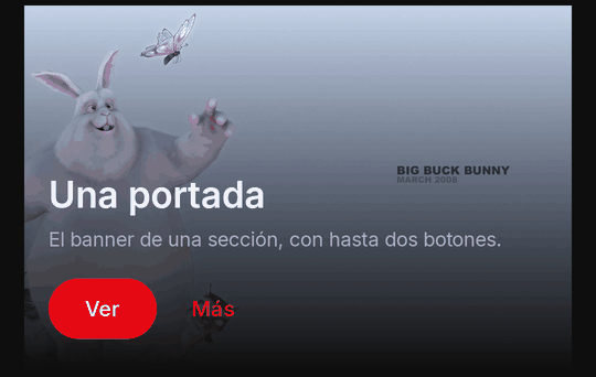
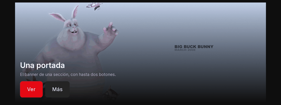
| Property | Type | Default | Per size | Notes |
|---|---|---|---|---|
title |
string | required | no | titleEn the English one |
text |
string | none | no | textEn |
image |
https URL | none | no | a public https picture |
logo |
https URL | none | no | additive, no new apiVersion: a title's logo (a public https picture) drawn where the title's text is, when it loads; the text still names it for a screen reader and shows when the logo cannot |
h |
a size of the scale | Kino's (240 dp, 320 on a TV) | yes | additive, no new apiVersion: the banner's height; a per-size map works ({ "compact": 200, "expanded": 240 }) |
buttons |
button nodes | none | no | at most 2 |
{ "type": "heroCard", "title": "Estreno", "titleEn": "Premiere", "text": "Un conejo y tres roedores.", "textEn": "A rabbit and three rodents.",
  "image": "https://peach.blender.org/wp-content/uploads/title_anouncement.jpg",
  "buttons": [
    { "type": "ElevatedButton", "labelText": "Ver", "labelTextEn": "Watch", "onPressed": { "go": { "titleByIds": { "tmdb": 10378, "kind": "movie" } } } },
    { "type": "TextButton", "labelText": "Más", "labelTextEn": "More", "onPressed": "more" }
  ] }
export async function screen() {
  return { type: "heroCard", title: "Destacado", image: "https://peach.blender.org/wp-content/uploads/title_anouncement.jpg", buttons: [{ type: "ElevatedButton", labelText: "Abrir", onPressed: "open-hero" }] };
}
- Limits and mistakes: at most 2 buttons (the rest dropped, logged), buttons only; an
httpimage is dropped.
Actions
What a press does is an action: a node's onTap and onLongPress, a button's onPressed, an input's onChanged
and onSubmitted, a form's onSubmitted, a menu item's onTap. Four shapes, plus a time budget:
onPressed: "refresh"                                        // an event for screenEvent; its arg is the node's arg
onPressed: { event: "read", arg: "story-42" }               // an event with its arg (at most 4,096 characters)
onPressed: { ui: [{ toggle: "details" }], event: "seen" }   // local operations first (no plugin call), then the event
onPressed: { go: { url: { href: "https://kinotvapp.github.io/kino-plugins/" } } } // somewhere in Kino, no plugin call
onPressed: { event: "login", timeoutMs: 28000 }               // this press's call may take up to 28 s
screenEvent receives { name, arg, value, state, route, device, lang } and answers what should change
(Answers). The event name open is reserved: Kino sends it once when the screen opens. Every
go target is in Navigation; the ui operations are below.
Buttons
ElevatedButton is Kino's primary button, Button with variant: "secondary" the secondary one, TextButton a flat
one and IconButton an icon (its labelText is what a screen reader says). confirm makes Kino ask before the action
runs; submit: true inside a Form checks and submits it; enabled: false draws it off.
| Property | Type | Default | Per size | Notes |
|---|---|---|---|---|
labelText |
string | required (not for IconButton) |
no | labelTextEn the English one; on an IconButton it is what a screen reader says |
icon |
a Kino icon name | none | no | required for IconButton (variant icon) |
variant |
primary | secondary | text | icon |
primary |
yes | set by ElevatedButton, TextButton, IconButton; secondary only as Button |
onPressed |
action | none | no | what a press does (Actions) |
confirm |
string | none | no | Kino asks this question (confirmEn) before the action runs |
submit |
boolean | false |
no | inside a Form: checks and submits the form (its own onPressed is ignored) |
{ "type": "Row", "wrap": true, "gap": 8, "children": [
  { "type": "ElevatedButton", "labelText": "Guardar", "labelTextEn": "Save", "icon": "bookmark", "onPressed": "save" },
  { "type": "Button", "variant": "secondary", "labelText": "Compartir", "labelTextEn": "Share", "onPressed": "share" },
  { "type": "TextButton", "labelText": "Borrar", "labelTextEn": "Delete", "confirm": "¿Borrar?", "confirmEn": "Delete it?", "onPressed": "delete" },
  { "type": "IconButton", "icon": "heart", "labelText": "Me gusta", "labelTextEn": "Like", "onPressed": "like" }
] }
export async function screen({ state }) {
  return { type: "ElevatedButton", key: "send", labelText: state.sent ? "Enviado" : "Enviar", enabled: !state.sent, onPressed: { event: "send", arg: "now" } };
}

export async function screenEvent({ name }) {
  return name === "send" ? { state: { sent: true }, toast: "Enviado", toastEn: "Sent" } : null;
}
- TV: each button is a focus stop with Kino's ring; OK presses it. A disabled button is drawn off and does nothing.
- Phone and TV: the same variants; give a button a fixed
heightper size class for a thumb or a remote (a calculator-style matrix uses 80 on a phone, 48 on a TV). - Limits and mistakes: a button needs a
labelText(anIconButtonanicon), or it is dropped.onPressedworks on buttons only (elsewhere it isonTap).submitoutside a form is ignored (logged).OutlinedButtondoes not exist.
Busy and slow presses (loading, timeoutMs)
A press whose call takes long shows Kino's own pending cue: once the call of the person's press runs past 400 ms, the
button, FloatingActionButton, card or ListTile pressed is drawn in Kino's busy look (a spinner in its icon's place,
no press, read as busy) until your answer. loading: true on such a node draws the same look from your tree (a sign-in
you keep waiting on, say); on the TV the node keeps its focus.
An action object may give its event's call its own budget, timeoutMs (1,000 to 30,000 ms; the default stays 20,000):
only on a press (onPressed, onTap, onLongPress, onSubmitted, onTrailingTap) and honoured only when the person's
own press or submit sends it; a change, a timer, open or a load-more keep the default.
{ "type": "ElevatedButton", "key": "send", "labelText": "Enviar código", "labelTextEn": "Send code", "onPressed": { "event": "sendCode", "timeoutMs": 28000 } }
export async function screen({ state }) {
  return { type: "ElevatedButton", key: "refresh", labelText: "Actualizar", loading: state.refreshing === true, onPressed: "refresh" };
}
- Limits and mistakes:
timeoutMsoutside 1,000..30,000 is clamped, on a non-press or without an event ignored (logged).loadingelsewhere than a button, aFloatingActionButton, a card or aListTilewithonTapis ignored (logged).
FloatingActionButton
Flutter's FloatingActionButton: one per screen (another is dropped, logged), drawn by Kino over the bottom end (or
centre, fabPosition) of your area, never in place, never under the system bars or the keyboard; in a Scaffold above
its bottom bar, in a player panel over the drawer's body. With a labelText it is the extended form. Never inside a
list, a table, a pop-up, a ListTile or an image's fallback (dropped, logged). It takes selected, badge, autofocus
and tooltip; on the TV it is a focus stop with Kino's ring, reached by the D-pad.
| Property | Type | Default | Per size | Notes |
|---|---|---|---|---|
icon |
a Kino icon name | required | no | drawn on Kino's primary fill |
labelText |
string | none | no | the extended form: the label beside the icon (labelTextEn); else what a screen reader says is the tooltip, else Kino's own word |
onPressed |
action | required | no | what a press does |
fabPosition |
end | center |
end |
yes | bottom end or bottom centre of the plugin's area, never under the system bars or the keyboard (floating action button) |
{ "type": "Column", "children": [
  { "type": "Text", "text": "Tus listas", "textEn": "Your lists", "style": "h3" },
  { "type": "FloatingActionButton", "icon": "add", "labelText": "Nueva", "labelTextEn": "New", "onPressed": "newList" }
] }
Tooltip
tooltip (and tooltipEn), on any node that does something (a button, a field, a choice, a FloatingActionButton, any
node with onTap or onLongPress; elsewhere ignored, logged), at most 80 characters: Kino's own hint. A phone shows it
on a long press (a node with its own onLongPress shows none: its action wins), a TV after about 800 ms of focus (until
focus leaves), and a screen reader gets it as the long press's label. It never takes focus or a press. Never put
essential information in a tooltip: a person who never long-presses, or a TV that moves on quickly, never sees it. A
disabled node shows yours too (Kino adds no hint of its own).
{ "type": "IconButton", "icon": "share", "labelText": "Compartir", "labelTextEn": "Share", "tooltip": "Copia el enlace del episodio", "tooltipEn": "Copies the episode's link", "onPressed": "share" }
Chips
One choice (or several with multiple) among a few options, drawn as chips: filters over a list, categories, tags. An
input: its value is in state.inputs, and onChanged reports the change.
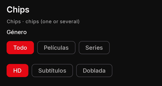
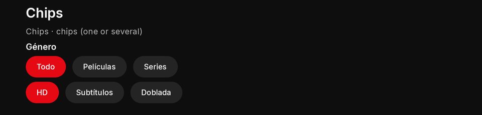
| Property | Type | Default | Per size | Notes |
|---|---|---|---|---|
key |
string | required | no | names the value in state.inputs; unique on the screen |
labelText |
string | none | no | the field's label (labelTextEn) |
hintText |
string | none | no | a hint inside or under it (hintTextEn) |
onChanged |
action | none | no | the person changed it; the event's value is the new value |
options |
{ value, label, labelEn? }[] |
required | no | 1 to 500, values distinct |
multiple |
boolean | false |
no | several chips may be picked |
value |
string or string[] | none | no | the picked value (a list with multiple); a value naming no option is dropped |
bind |
a setting key | none | no | shows and stores one of your select or text settings (bind) |
required |
boolean | false |
no | form rule: a text not blank, a choice made, a toggle on, a chip picked |
minLength |
integer | none | no | form rule: characters (chips: picked chips) |
maxLength |
integer | none | no | form rule: characters (chips: picked chips) |
errorText |
string | Kino's text | no | form rule: what the person reads under the failing field (errorTextEn) |
forceErrorText |
string | none | no | your own verdict under the field (forceErrorTextEn, at most 200 characters) until the person edits it (validation) |
{ "type": "Chips", "key": "genre", "value": "all", "onChanged": "filter", "options": [
  { "value": "all", "label": "Todo", "labelEn": "All" },
  { "value": "movies", "label": "Películas", "labelEn": "Movies" },
  { "value": "series", "label": "Series" }
] }
export async function screen({ state }) {
  const picked = Array.isArray(state.inputs?.extras) ? state.inputs.extras : ["hd"];
  return { type: "Column", gap: 8, children: [
    { type: "Chips", key: "extras", multiple: true, value: picked, onChanged: "extras", options: [{ value: "hd", label: "HD" }, { value: "sub", label: "Subtítulos" }] },
    { type: "Text", text: "Elegidos: " + picked.join(", ") },
  ] };
}
- TV: Left and Right stay inside the row of chips; entering it lands on the picked chip; OK picks.
- Limits and mistakes: 1 to 500 options with distinct values; a
valuenaming no option is dropped (logged). In aForm,minLengthandmaxLengthcount the picked chips.
Toasts
A short message at the bottom, from an answer: a string, or { text, textEn?, role?, action?, ms? }. One at a time (a
newer one replaces it); its action sends its event once.
{ "toast": { "text": "Elemento borrado", "textEn": "Item deleted", "role": "success", "ms": 6000,
  "action": { "label": "Deshacer", "labelEn": "Undo", "event": "undo" } } }
export async function screenEvent({ name, lang }) {
  if (name === "save") return { toast: lang === "es" ? "Guardado" : "Saved" };
  if (name === "delete") return { toast: { text: "Borrado", textEn: "Deleted", action: { label: "Deshacer", labelEn: "Undo", event: "undo" } } };
  return null;
}
- TV: the toast never takes focus by itself: Down from the bottom of the tree reaches its action (Up or Back leaves it), and the remote's Menu or Play/Pause key runs it; the toast says so in words.
- Limits and mistakes:
ms2,000 to 8,000 (default 3,500). A string toast takes its English twin intoastEn; the object takestextEn.
Local ui operations
Operations Kino runs at once, with no call to your plugin, on other nodes of the same screen by key: show a details
block, disable a button, fill a field, open a declared pop-up. At most 8 per action or answer;
an unknown key is ignored (logged). What they do is kept in state.ui (hidden, enabled, and open for each
accordion), so your next call sees it and a re-render keeps it.
| Operation | Shape | What it does |
|---|---|---|
show |
{ show: key } |
shows a hidden node |
hide |
{ hide: key } |
hides it (kept in state.ui.hidden) |
toggle |
{ toggle: key, prop? } |
shows or hides it; with prop: "selected", flips a button's or a tappable card's selected |
enable |
{ enable: key } |
turns it on |
disable |
{ disable: key } |
draws it off (kept in state.ui.enabled) |
focus |
{ focus: key } |
moves the focus there; dropped in an onClose |
set |
{ set: { key, value } } |
gives an input a value: a string (at most 2,000 characters), a boolean, a number, or up to 500 strings for Chips; on a button or a tappable card, true or false is its selected; no event fires |
clear |
{ clear: key } |
empties an input |
open |
{ open: key } |
opens a declared pop-up (replacing an open one); in an answer it waits for the new tree; dropped in an onClose |
close |
{ close: key } |
closes it when it is the one open |
{ "type": "Column", "gap": 8, "children": [
  { "type": "Text", "key": "details", "text": "Detalles", "textEn": "Details", "hidden": true },
  { "type": "TextButton", "labelText": "Más", "labelTextEn": "More", "onPressed": { "ui": [{ "toggle": "details" }] } },
  { "type": "TextField", "key": "q", "labelText": "Buscar", "labelTextEn": "Search" },
  { "type": "TextButton", "labelText": "Limpiar", "labelTextEn": "Clear", "onPressed": { "ui": [{ "clear": "q" }, { "focus": "q" }] } }
] }
- Mistakes: a
setvalue fires no event (read it fromstate.inputson the next call);state.uiis Kino's record, but you may set its keys yourself in astatepatch. selected(shared properties):{ toggle: key, prop: "selected" }flips a button's or a tappable card'sselectedand{ set: { key, value: true } }sets it, at once and with no call. Kino keeps that value only until your next render says it again (it is not instate.ui), so also send the event and keep it in your own state. Any otherpropdrops the operation (logged); withoutprop,togglestill meanshidden.