Screen components: forms, pop-ups and navigation
Available with Kino 0.9.74
Available from Kino 0.9.74. An older Kino refuses these plugins with
«Este plugin necesita una versión más nueva de Kino»; to keep reaching people on an older version use
enhancements (see Screens without raising your apiVersion).
This is the second part of the component catalogue of a screen: the inputs and forms, the pop-ups and
everything a node can open with go. The catalogue has three pages:
- Layout, content and actions:
ColumntoListTile,TexttoheroCard, buttons to theuioperations. - Forms, pop-ups and navigation (this page):
Formtobindandconfig,Dialogtoanchor, everygoshape and routes. - Data, behaviour and recipes: state, inputs, events, answers, timers, per-size values, style, common properties, animations, limits, and the recipes.
What a screen is, how it is declared and how it answers is in the guide, Screens.
Forms
Inputs hold values Kino keeps in state.inputs by key (Inputs). Inside a Form they also
take rules that Kino checks before anything reaches your code.
Form
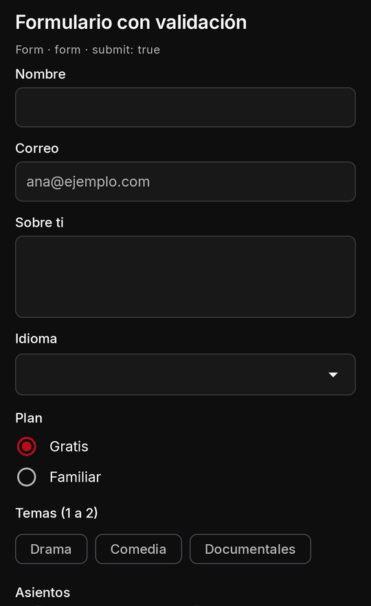
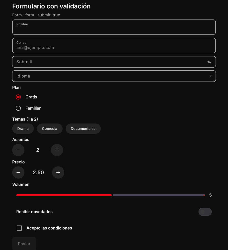
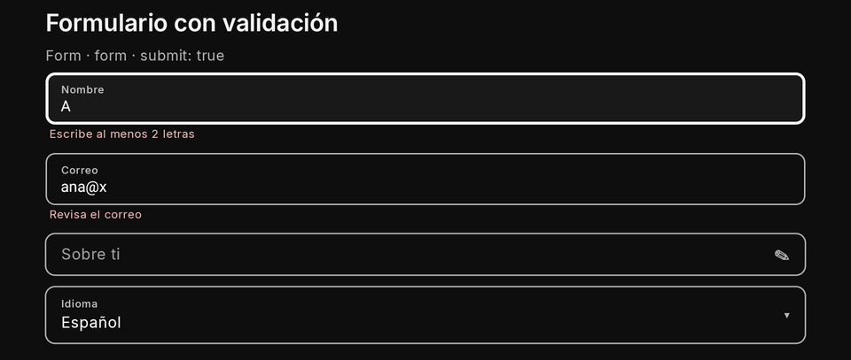
Fields with one submit: a button with submit: true checks every field, shows the errors under each failing one and
focuses the first; only a valid form runs the form's onSubmitted, whose event value holds every field by key.
| Property | Type | Default | Per size | Notes |
|---|---|---|---|---|
children |
nodes (its fields among them)[] | none | no | its children, drawn in order |
onSubmitted |
action | required | no | runs only when every field passes; its event's value holds every field by key |
{ "type": "Form", "key": "contact", "onSubmitted": "send", "gap": 12, "children": [
  { "type": "TextField", "key": "email", "kind": "email", "labelText": "Correo", "labelTextEn": "Email", "required": true,
    "pattern": "^[^@\\s]+@[^@\\s]+\\.[A-Za-z]{2,}$", "errorText": "Revisa el correo", "errorTextEn": "Check the email" },
  { "type": "TextField", "key": "msg", "labelText": "Mensaje", "labelTextEn": "Message", "multiline": true, "maxLength": 500, "required": true },
  { "type": "Checkbox", "key": "ok", "labelText": "Acepto", "labelTextEn": "I agree", "required": true },
  { "type": "ElevatedButton", "labelText": "Enviar", "labelTextEn": "Send", "submit": true }
] }
export async function screen() {
  return { type: "Form", key: "contact", onSubmitted: "send", gap: 12, children: [
    { type: "TextField", key: "name", labelText: "Nombre", required: true, minLength: 2 },
    { type: "ElevatedButton", labelText: "Enviar", submit: true },
  ] };
}

export async function screenEvent({ name, value }) {
  if (name !== "send") return null;
  return { state: { sentBy: value.name }, toast: "Enviado", toastEn: "Sent" }; // value: every field by key, already checked
}
- TV: the error moves focus to the first failing field.
- Phone and TV: identical rules; only the text entry differs (TextField).
- Limits and mistakes: a form without
onSubmittedis dropped; forms do not nest (write two siblings); an answer's pop-up takes none (a declared one does). Enter does not submit a form.
TextField
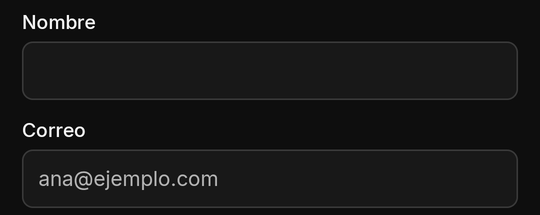
A text field: a name, a search box, an email. kind picks the keyboard (text, number, email, url, search).
onSubmitted is the keyboard's action; onChanged reports changes. A trailingIcon (one of Kino's
icons) is drawn inside the field's box at its end, a chat's «Enviar» or a search's lens:
its onTrailingTap is sent like onSubmitted, with what the field holds now as the event's value, and trailingLabel
(trailingLabelEn, at most 40 characters) is what a screen reader says for it.
| Property | Type | Default | Per size | Notes |
|---|---|---|---|---|
key |
string | required | no | names the value in state.inputs; unique on the screen |
labelText |
string | none | no | the field's label (labelTextEn) |
hintText |
string | none | no | a hint inside or under it (hintTextEn) |
onChanged |
action | none | no | the person changed it; the event's value is the new value |
kind |
text | number | email | url | search |
text |
no | the keyboard; there is no password kind (a masked field is obscureText) |
value |
string | "" |
no | the starting text (what state.inputs holds wins); ignored on an obscureText field |
obscureText |
boolean | false |
no | masked like a password on phone and TV, with Kino's show / hide; never in your state, sent only with the person's own tap or submit, then cleared (secret fields); one line only; binds only a password setting |
maxLength |
1 to 2,000 | 2,000 | no | also a form rule |
onSubmitted |
action | none | no | the keyboard's action (Enter); on the TV, the text dialog's accept |
trailingIcon |
one of the 50 icons | none | yes | drawn inside the field's box at its end, tinted by color; never on a disabled field; needs trailingLabel and onTrailingTap, else the field is drawn without it (logged) |
trailingLabel |
1 to 40 characters | none | no | what a screen reader says for the icon (trailingLabelEn in English); required with trailingIcon |
onTrailingTap |
action | none | no | the icon's press: sent like onSubmitted, with the field's current text as value (a person's press); on the TV the icon is its own focus stop, Right from the field |
bind |
a setting key | none | no | shows and stores one of your text settings (bind) |
required |
boolean | false |
no | form rule: a text not blank, a choice made, a toggle on, a chip picked |
minLength |
integer | none | no | form rule: characters (chips: picked chips) |
pattern |
string | none | no | form rule: must match the whole value; Kino's own safe subset, at most 200 characters (Patterns) |
errorText |
string | Kino's text | no | form rule: what the person reads under the failing field (errorTextEn) |
forceErrorText |
string | none | no | your own verdict under the field (forceErrorTextEn, at most 200 characters) until the person edits it (validation) |
{ "type": "TextField", "key": "q", "kind": "search", "labelText": "Buscar", "labelTextEn": "Search", "hintText": "Una película", "hintTextEn": "A film", "maxLength": 100, "onSubmitted": "search" }
export async function screen({ state }) {
  return { type: "Column", gap: 8, children: [
    { type: "TextField", key: "q", kind: "search", labelText: "Buscar", onSubmitted: "search" },
    { type: "Text", text: state.query ? "Buscaste: " + state.query : "Escribe algo" },
  ] };
}

export async function screenEvent({ name, state }) {
  if (name === "search") return { state: { query: String(state.inputs.q ?? "").trim().slice(0, 100), inputs: { q: "" } } };
  return null;
}
A chat's field with its send icon inside (the icon and Enter send the same event):
{ "type": "TextField", "key": "msg", "hintText": "Escribe un mensaje", "hintTextEn": "Type a message", "maxLength": 300,
  "onSubmitted": "send", "trailingIcon": "send", "trailingLabel": "Enviar", "trailingLabelEn": "Send", "onTrailingTap": "send" }
- Trailing icon: all three of
trailingIcon,trailingLabelandonTrailingTap, or the field is drawn without the icon (logged): an unknown icon, a missing or too long label, a missing or bad action.trailingIconmay be a per-size map (a class without one draws no icon there). Never shown on a disabled field. Only on a one-line field: aTextFieldwith several lines ignores it (logged). - Phone and TV: on the phone a press on the icon sends the text as typed, its pending change first. On the TV the icon is a focus stop of its own inside the field's box: Right from the field reaches it, Left goes back, Up and Down leave as from the field; OK on it sends what the field holds.
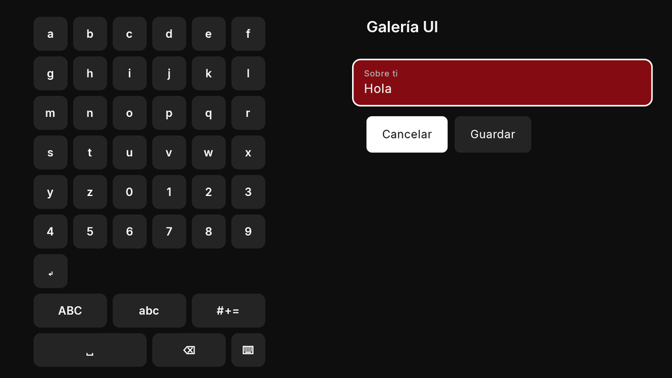
- TV: text on the TV is a simulated input: the field draws as a row showing its value that, pressed, opens Kino's
TV text dialog with its on-screen keyboard.
onChangedand thenonSubmittedfire once, when the dialog is accepted, with the final value, untrimmed. A hardware keyboard on a TV commits on Enter or when focus leaves. - Phone and TV: the phone uses a normal field and the phone's keyboard;
onChangedis debounced (300 ms). Your code cannot tell how a value was entered and never needs to. - Limits and mistakes:
keyis required (a missing or repeated input key drops the node). There is no password kind: a masked field isobscureText: true(secret fields). To clear or prefill a field, answer{ state: { inputs: { q: "" } } }. Kino never autofills the person's saved data.
Secret fields (obscureText)
obscureText: true masks a one-line TextField like a password, on the phone (dots, the password keyboard, Kino's show /
hide eye when there is no trailingIcon) and on the TV (dots on the field, the text dialog masked with its show / hide
toggle, the same D-pad path as any field). Put it in a Form to check and send a token or a password with a «Siguiente»:
{ "type": "Form", "key": "login", "onSubmitted": "next", "children": [
  { "type": "TextField", "key": "token", "obscureText": true, "labelText": "Token", "required": true, "minLength": 20 },
  { "type": "ElevatedButton", "labelText": "Siguiente", "labelTextEn": "Next", "submit": true }
] }
export async function screenEvent({ name, value }) {
  if (name !== "next") return null;
  const ok = /^[A-Za-z0-9_-]{20,}$/.test(value.token); // what was typed, only in this call
  return ok ? { state: { step: "done" } } : { toast: "Token no válido", toastEn: "Invalid token" }; // the field is now empty
}
- Where the text goes: only with the person's own tap or submit, in
state.inputs.<key>and, for the form's or the field's ownonSubmitted(oronTrailingTap), invalue. Never in ascreen()render, a change, a timer's tick,open, a load-more or a pop-up'sonClose. - Never kept: not in the screen's state (so not in a player panel's kept state, a restored screen or anything that
syncs), not in Kino's logs or crash reports, not in the keyboard's suggestions or Autofill. Once the call that carried it
ends (answered, failed or timed out) the field is empty again, unless your answer gives a text back in
state: { inputs: { <key>: "..." } }(kept in memory only) or the person typed something new meanwhile. The screen closing forgets it. - Its own rules:
valuefrom the tree andonChangedare ignored (logged);obscureTextthat is nottrueorfalse, or on a field with several lines, drops the field. The form rules (required,minLength,pattern) check what was typed. bind: only to apasswordsetting (and a password binds only to a secret field): the field always starts empty (a password is never read back) and writes what was typed on commit; an empty field never clears the password (useconfig: { <key>: null }).- Editing a saved secret: a stored secret is never shown, so the field starts empty. Leave it
required: false(apatternorminLengthstill checks what was typed, and an empty field passes) and read an emptyvalueas "keep the stored one": writeconfigonly when the person typed something, and offer a separate button that sendsconfig: { <key>: null }to remove it.
TextField with several lines
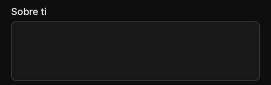
A TextField with multiline: true (or a maxLines above 1 in any size class) takes several lines: a message, a note.
Kino reads it as the older textArea.

| Property | Type | Default | Per size | Notes |
|---|---|---|---|---|
key |
string | required | no | names the value in state.inputs; unique on the screen |
labelText |
string | none | no | the field's label (labelTextEn) |
hintText |
string | none | no | a hint inside or under it (hintTextEn) |
onChanged |
action | none | no | the person changed it; the event's value is the new value |
multiline |
boolean | false |
no | true (or maxLines above 1) makes a TextField several lines |
maxLines |
integer | none | no | above 1 in any size class: several lines |
kind |
text | number | email | url | search |
text |
no | as a one-line field |
value |
string | "" |
no | the starting text |
maxLength |
1 to 2,000 | 2,000 | no | also a form rule |
onSubmitted |
action | none | no | sent on the TV only (the phone's multi-line keyboard has no submit: add a button) |
bind |
a setting key | none | no | shows and stores one of your text settings (bind) |
required |
boolean | false |
no | form rule: a text not blank, a choice made, a toggle on, a chip picked |
minLength |
integer | none | no | form rule: characters (chips: picked chips) |
pattern |
string | none | no | form rule: must match the whole value; Kino's own safe subset, at most 200 characters (Patterns) |
errorText |
string | Kino's text | no | form rule: what the person reads under the failing field (errorTextEn) |
forceErrorText |
string | none | no | your own verdict under the field (forceErrorTextEn, at most 200 characters) until the person edits it (validation) |
{ "type": "TextField", "key": "note", "labelText": "Nota", "labelTextEn": "Note", "multiline": true, "maxLength": 500 }
export async function screen() {
  return { type: "Column", gap: 8, children: [
    { type: "TextField", key: "note", labelText: "Nota", maxLines: 4, maxLength: 500 },
    { type: "ElevatedButton", labelText: "Guardar", onPressed: "saveNote" },
  ] };
}
- TV: the multi-line TV text dialog;
onSubmittedis sent on the TV only. - Mistakes: the phone's multi-line keyboard has no submit: always give the field a button.
DropdownButton
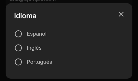
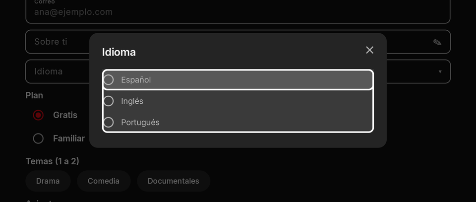
One choice among options in a closed field that opens a picker: a language, a sort order, a quality. Its value is the
option's value (or null before a choice).
| Property | Type | Default | Per size | Notes |
|---|---|---|---|---|
key |
string | required | no | names the value in state.inputs; unique on the screen |
labelText |
string | none | no | the field's label (labelTextEn) |
hintText |
string | none | no | a hint inside or under it (hintTextEn) |
onChanged |
action | none | no | the person changed it; the event's value is the new value |
options |
{ value, label, labelEn? }[] |
required | no | 1 to 500, values distinct |
value |
string | none (null) |
no | the chosen option's value |
bind |
a setting key | none | no | shows and stores one of your select or text settings (bind) |
required |
boolean | false |
no | form rule: a text not blank, a choice made, a toggle on, a chip picked |
errorText |
string | Kino's text | no | form rule: what the person reads under the failing field (errorTextEn) |
forceErrorText |
string | none | no | your own verdict under the field (forceErrorTextEn, at most 200 characters) until the person edits it (validation) |
{ "type": "DropdownButton", "key": "lang", "labelText": "Idioma", "labelTextEn": "Language", "value": "es", "onChanged": "lang", "options": [
  { "value": "es", "label": "Español", "labelEn": "Spanish" },
  { "value": "en", "label": "Inglés", "labelEn": "English" }
] }
export async function screen() {
  const sorts = [["new", "Más reciente"], ["title", "Título"]];
  return { type: "DropdownButton", key: "sort", labelText: "Ordenar", value: "new", onChanged: "sort", options: sorts.map(([value, label]) => ({ value, label })) };
}
- TV: OK opens Kino's picker; focus stays inside it until a choice or Back (over an open pop-up, only the picker is focusable).
- Limits and mistakes: 1 to 500 options with distinct values.
bindholds aselectortextsetting.
RadioGroup
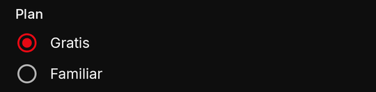
One choice among a few options, all visible at once: two to five choices the person should compare.

| Property | Type | Default | Per size | Notes |
|---|---|---|---|---|
key |
string | required | no | names the value in state.inputs; unique on the screen |
labelText |
string | none | no | the field's label (labelTextEn) |
hintText |
string | none | no | a hint inside or under it (hintTextEn) |
onChanged |
action | none | no | the person changed it; the event's value is the new value |
options |
{ value, label, labelEn? }[] |
required | no | 1 to 500, values distinct |
value |
string | none (null) |
no | the chosen option's value |
bind |
a setting key | none | no | shows and stores one of your select or text settings (bind) |
required |
boolean | false |
no | form rule: a text not blank, a choice made, a toggle on, a chip picked |
errorText |
string | Kino's text | no | form rule: what the person reads under the failing field (errorTextEn) |
forceErrorText |
string | none | no | your own verdict under the field (forceErrorTextEn, at most 200 characters) until the person edits it (validation) |
{ "type": "RadioGroup", "key": "plan", "labelText": "Plan", "value": "free", "options": [
  { "value": "free", "label": "Gratis", "labelEn": "Free" },
  { "value": "family", "label": "Familiar", "labelEn": "Family" }
] }
export async function screen() {
  return { type: "RadioGroup", key: "quality", labelText: "Calidad", value: "auto", onChanged: "quality", options: ["auto", "720p", "1080p"].map((value) => ({ value, label: value })) };
}
- Mistakes: in a form, a failing
RadioGroup's error shows on the group.
Checkbox
A check box with its label: "I accept the terms", one item of a list to pick. In a form, required means ticked.


| Property | Type | Default | Per size | Notes |
|---|---|---|---|---|
key |
string | required | no | names the value in state.inputs; unique on the screen |
labelText |
string | none | no | the field's label (labelTextEn) |
onChanged |
action | none | no | the person changed it; the event's value is the new value |
value |
boolean | false |
no | ticked or not |
bind |
a setting key | none | no | shows and stores one of your toggle settings (bind) |
required |
boolean | false |
no | form rule: a text not blank, a choice made, a toggle on, a chip picked |
errorText |
string | Kino's text | no | form rule: what the person reads under the failing field (errorTextEn) |
forceErrorText |
string | none | no | your own verdict under the field (forceErrorTextEn, at most 200 characters) until the person edits it (validation) |
{ "type": "Checkbox", "key": "terms", "labelText": "Acepto las condiciones", "labelTextEn": "I accept the terms", "required": true, "errorText": "Hace falta aceptarlas", "errorTextEn": "You need to accept them" }
export async function screen({ state }) {
  return { type: "Checkbox", key: "remember", labelText: "Recordarme", value: state.inputs?.remember === true };
}
Switch
An on/off setting that applies at once. With bind it stores one of your toggle settings by itself.


| Property | Type | Default | Per size | Notes |
|---|---|---|---|---|
key |
string | required | no | names the value in state.inputs; unique on the screen |
labelText |
string | none | no | the field's label (labelTextEn) |
onChanged |
action | none | no | the person changed it; the event's value is the new value |
value |
boolean | false |
no | on or off |
bind |
a setting key | none | no | shows and stores one of your toggle settings (bind) |
required |
boolean | false |
no | form rule: a text not blank, a choice made, a toggle on, a chip picked |
errorText |
string | Kino's text | no | form rule: what the person reads under the failing field (errorTextEn) |
forceErrorText |
string | none | no | your own verdict under the field (forceErrorTextEn, at most 200 characters) until the person edits it (validation) |
{ "type": "Switch", "key": "autoplay", "labelText": "Reproducir solo", "labelTextEn": "Autoplay", "value": true, "onChanged": "autoplay" }
export async function screen() {
  return { type: "Switch", key: "tipsSwitch", labelText: "Mostrar consejos", bind: "tips" }; // "tips" is a toggle setting of the manifest
}
- TV: OK flips it. Mistakes: a
Switchis a toggle: for a choice of two named options use aRadioGroup.
Slider
A number between min and max, by step: a volume, a level. Its value in state.inputs is a number.


| Property | Type | Default | Per size | Notes |
|---|---|---|---|---|
key |
string | required | no | names the value in state.inputs; unique on the screen |
labelText |
string | none | no | the field's label (labelTextEn) |
hintText |
string | none | no | a hint inside or under it (hintTextEn) |
onChanged |
action | none | no | the person changed it; the event's value is the new value |
min |
number | 0 |
no | below max |
max |
number | 100 |
no | above min |
step |
number | none (continuous) | no | above 0 and at most max - min |
value |
number | min |
no | clamped to min..max |
bind |
a setting key | none | no | shows and stores one of your text settings (bind) |
forceErrorText |
string | none | no | your own verdict under the field (forceErrorTextEn, at most 200 characters) until the person edits it (validation) |
{ "type": "Slider", "key": "volume", "labelText": "Volumen", "labelTextEn": "Volume", "min": 0, "max": 10, "step": 1, "value": 5, "onChanged": "volume" }
export async function screen({ state }) {
  const v = Number.isFinite(state.inputs?.level) ? state.inputs.level : 30;
  return { type: "Column", gap: 8, children: [
    { type: "Slider", key: "level", min: 0, max: 100, step: 10, value: v, onChanged: "level" },
    { type: "Text", text: "Nivel " + v },
  ] };
}
- Mistakes:
minmust be belowmax(else dropped); astepoutside0..max-minis dropped (logged). No form rules of its own;bindholds atextsetting (its number as text).
NumberStepper
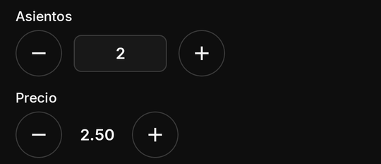
A number drawn [ − ] value [ + ]: seats, servings, a price. Each press moves it by step, kept within min..max and
rounded to decimals; holding a button repeats, slowly faster. Its value in state.inputs is text ("2.50").
Flutter's Stepper is another widget (a wizard): that name is unknown here.

| Property | Type | Default | Per size | Notes |
|---|---|---|---|---|
key |
string | required | no | names the value in state.inputs; unique on the screen |
labelText |
string | none | no | the field's label (labelTextEn) |
hintText |
string | none | no | a hint inside or under it (hintTextEn) |
onChanged |
action | none | no | the person changed it; the event's value is the new value |
value |
number | min, else 0 |
no | rounded to decimals; in state.inputs as text ("2.50") |
min |
number | none | no | below max |
max |
number | none | no | above min |
step |
number > 0 | 1 |
no | rounded to decimals |
decimals |
0 to 6 | 0 |
no | |
editable |
boolean | false |
no | lets the person type it (digits only); only with decimals: 0 and a min of 0 or more |
bind |
no | not taken (ignored, logged) | ||
required |
boolean | false |
no | form rule: a text not blank, a choice made, a toggle on, a chip picked |
errorText |
string | Kino's text | no | form rule: what the person reads under the failing field (errorTextEn) |
forceErrorText |
string | none | no | your own verdict under the field (forceErrorTextEn, at most 200 characters) until the person edits it (validation) |
{ "type": "Column", "gap": 12, "children": [
  { "type": "NumberStepper", "key": "seats", "labelText": "Asientos", "labelTextEn": "Seats", "value": 2, "min": 1, "max": 8, "editable": true },
  { "type": "NumberStepper", "key": "price", "labelText": "Precio", "labelTextEn": "Price", "value": 2.5, "min": 0, "max": 10, "step": 0.25, "decimals": 2 }
] }
export async function screen({ state }) {
  const seats = Number(state.inputs?.seats ?? "2"); // text in state.inputs
  return { type: "Column", gap: 8, children: [
    { type: "NumberStepper", key: "seats", value: seats, min: 1, max: 8, onChanged: "seats" },
    { type: "Text", text: "Total: " + seats * 5 },
  ] };
}
- TV: Left and Right move between −, the value (only when
editable) and +; a button at its limit stays focusable (drawn off), so holding OK never drops focus.editableopens the TV's digits-only pad. - Limits and mistakes: at most 6 decimals; numbers at most 1e15 either way (clamped, logged).
editableonly withdecimals: 0and aminof 0 or more (else ignored, logged). Nobind. Itsrequiredalways passes (it always has a value).
Focus on TV
Kino draws one of two focus looks on the TV, by the kind of node; a plugin never chooses it.
| Node | Focus on TV |
|---|---|
Switch, Checkbox, each RadioGroup row |
row: a soft tint over the whole row and an accent underline across its bottom edge |
TextField (one line or several), DropdownButton, Slider |
row |
buttons (ElevatedButton, TextButton, IconButton...), FloatingActionButton |
ring: a white outline and a soft fill |
Chips, TabBar, NavigationBar items, NumberStepper buttons |
ring |
a pressable Card, ListTile, Text or Icon; title cards |
ring |
A row keeps at least 16 dp between its edges and its text, so neither the tint nor the underline touches a letter. A
screen reader reads the focused node as before. The settings node is Kino's own settings form: its switch and option
rows show the row look too, as every full-width row and field in Kino does on the TV. On the TV its rows are at least
56 dp tall (12 dp above and below their text, a select's options 4 dp apart, 8 dp under its label), so a focused row's
underline never touches the next; on the phone at least 48 dp. Its rows hold no D-pad key of their own: Up and Down from
its first or last row go on as from any node (the row above, else a page, else the AppBar's tab), and Left and Right
stay on a switch or option row.
How focus moves around a whole screen is in the guide: Focus on TV.
Validation
Every input in a Form takes the rules the inputs table lists:
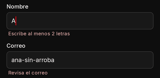
required: a text not blank, a choice made, a toggle or checkbox on, a chip picked. An empty field that is not required passes every check.minLength/maxLength: characters of a text; picked chips of aChips.pattern: a pattern the whole text must match.errorText/errorTextEn: what the person reads under the failing field (aRadioGroup's orChips' on the group); without it Kino's own message.
Values of fields that are hidden or disabled are still sent, unchecked; a required field in a hidden
TableRow is not checked.
Your own verdict: forceErrorText (and forceErrorTextEn), Flutter's, on any input, from your state: Kino draws it
under the field exactly as its own errors (a failed submit's wins while it shows) and a screen reader reads it with the
field. The person's edit of the field hides it until your next verdict: the answer to their next press or submit, or a
different text. At most 200 characters. It never blocks a submit.
{ "type": "TextField", "key": "code", "kind": "number", "labelText": "Código", "labelTextEn": "Code", "forceErrorText": "El código no es válido", "forceErrorTextEn": "That code is not valid" }
Rules on a field outside a form are not used. Kino's verdict is the one that counts: check again in your code only what your own logic needs.
Patterns (Kino's own matcher)
The pattern engine is Kino's own (a linear-time matcher, the same in the app and the kit), never the platform's
regex, so a hostile pattern cannot freeze the device. A pattern must match the whole value, in a safe subset:
literals, ., ^, $, |, groups ( ) and (?: ), classes [...], the escapes \d \D \w \W \s \S \b \B \n \r \t
and escaped punctuation, the quantifiers * + ? {n} {n,} {n,m} (optionally lazy), which may nest. No backreferences, no
lookarounds. The meanings are ASCII: \d is [0-9], \w [A-Za-z0-9_], \s ASCII whitespace, . any character but a
newline.
| Limit | Value |
|---|---|
| A pattern | at most 200 characters |
A count ({n,m}) |
at most 1,000 |
| Steps once counts are expanded | at most 500 (so [a-z]{1,600} is refused: write [a-z]+ and maxLength: 600) |
| Work to read one pattern | 20,000 units |
| One submit | at most 16 patterns and 4,000,000 matcher steps; past either, the remaining patterns pass |
A pattern outside the subset is dropped (logged) and the field still checks its other rules.
pattern: "^[^@\\s]+@[^@\\s]+\\.[A-Za-z]{2,}$" // an email (in JSON, every backslash doubled)
pattern: "^\\d{4,6}$"                          // a code of 4 to 6 digits
pattern: "^[A-Za-z0-9 ]+$"                     // letters, digits and spaces
Submit rules
- The button with
submit: truesubmits; its ownonPressedis ignored. It is drawn off while a required field is empty. - An invalid form never calls your code: errors show under each failing field and focus goes to the first.
- Enter does not submit a form, and a field's own
onSubmittedinside a form runs without the form's check. - A required field in a closed
ExpansionTileitem does not keep the button off, but the submit checks it and, if it fails, opens the item and focuses it. - The form's
onSubmittedgetsvalue: every field's value by key (the same types asstate.inputs).
settings node
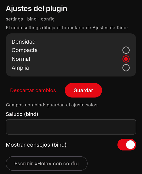
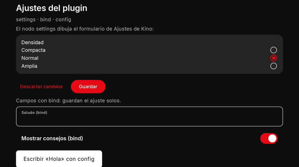
Kino's own settings form for your plugin, the very one Ajustes shows, inside your screen: every setting type, both
languages, validation, Kino's fields for secrets and its buttons for actions, «Enviar a otro aparato», its own save.
keys shows only those settings, in that order. Your code never sees what is typed in it; with onSaved it hears
that a save or an action button finished, never the values (onSaved). The form itself is described in
The settings form; the guide shows it in a screen in Settings inside a
screen.
| Property | Type | Default | Per size | Notes |
|---|---|---|---|---|
keys |
string[] | all settings | no | only those settings, in that order; each setting shows at most once per screen |
autoSave |
boolean | false |
no | its toggle and select settings save as they change (no validateSettings); with only those, no Guardar (settings node) |
onSaved |
event name or { event, arg? } |
none | no | sent after Kino's form here saved (Guardar, or an autosave) or one of its action buttons finished: value is { kind, ok, keys, action?, reason? }, setting keys only, never a value (onSaved) |
{ "type": "Column", "gap": 12, "children": [
  { "type": "Text", "text": "Ajustes", "textEn": "Settings", "style": "h3" },
  { "type": "settings", "keys": ["density"] }
] }
autoSave:truesaves the node's toggles and selects as the person changes them, through the same store and sync (yourvalidateSettingsis not asked, as withbind; your web session stays); a refused write puts the stored value back. When every valued setting the node shows is a toggle or a select, Kino draws no Guardar nor Descartar; a text, an address, a password or a list keeps them. A locked setting saves only after its code.- Only buttons: a node whose keys hold no valued setting (
keys: ["logout"]: an action, a status, a section, a link, a help, a QR) draws just those items and no Guardar nor Descartar; the action runs from its own button, itsconfirmfirst, exactly as in Ajustes. - A locked setting (
"unlockWith": "adultCode"in the manifest, a toggle or a select): moving it away from its default here asks the device's 18+ code with Kino's own prompt first (phone and TV); a wrong code or Cancelar keeps the old value, back toward the default never asks. Only this node (and Ajustes) changes it away from the default: neverbindorconfig(A setting the 18+ code guards). - Limits and mistakes: never inside a
Formor an answer's pop-up. Each setting shows at most once per screen, so severalsettingsnodes are fine. Aurlsetting can only be filled here (never throughbindorconfig). Apasswordcan be filled here, by an answer'sconfig, or by anobscureTextfield bound to it (secret fields).
onSaved
onSaved (an event name or { event, arg }) is sent after Kino's form in this node saved (its Guardar, or, with
autoSave, a toggle or select that saved as it changed: kind: "save" with that key; an autosave that changed nothing
sends none) or one of its action buttons finished (a node with only buttons has no Guardar: only kind: "action"), so
your screen reacts at once instead of on its next every tick. Quick autosaves still waiting are
merged into one event. The event's value:
| Field | What it holds |
|---|---|
kind |
"save" or "action" |
ok |
true when it saved, or the action ran and answered |
keys |
the settings that changed (keys only, sorted): what was edited, what an action cleared or set; never a value |
action |
the action button's key (kind: "action" only) |
reason |
when not ok: rejected (your validateSettings refused), checkFailed (it could not check), refused (Kino's store refused), failed (the action threw or timed out) |
export async function screenEvent({ name, value }) {
  if (name === "saved" && value.ok && value.keys.includes("twoStepPassword")) return { state: { step: "login" } };
  return null;
}
- Order and pace: it waits in the screen's queue like the person's own events (a timer's tick never runs before it). A save while an earlier save's event still waits is merged into it (the keys of both, the later verdict); action events are never merged. It is nobody's press: its answer opens no title page and no link.
- A closed screen: a save or action that ends after the screen closed (or after the node left the tree) sends
nothing; the next opening's
openreadskino.configas always. The save itself always lands. - Never a value: a password's key may be in
keys, its text never is.
bind and config
bind: "<settingKey>"on an input shows the stored value when the screen opens and writes the person's change back by itself: a choice on change, a text on commit (the keyboard's action, focus leaving, the TV dialog's accept), only when it differs. You still get the field's events. A plain settings tab needs no JavaScript at all.config: { <settingKey>: value }in an answer writes settings from your code: only keys your manifest declares, at most 32 per answer, each value fitting its type (texta string,togglea boolean,selectone of its values,listan array of records,passworda string).- A
passwordis kept exactly as given (never trimmed);null,""or blanks empty it (never arequiredone); at most 500 characters. It is saved where Ajustes saves a typed one: a synced password reaches the person's other devices (an emptied one is cleared there too), a"sync": falseone stays on this device. A screen never reads one back (bindnever prefills it,statenever holds it) and Kino never writes its text in a log line, only its key. Bind one only with anobscureTextfield (secret fields). - Never from a screen: a
urlsetting, anactionor ahelpsetting, a value holding one of your sealed secrets, alistwrite that adds an address, a setting withunlockWithmoved away from its default (no field binds one). All dropped, logged. - Pace and cost: each setting is written at most once every 500 ms per screen (a timer's answer: once a minute); every
write restarts your runtime so
kino.configreads the new value (toggles and selects keep your web session; any other write is Kino's full Guardar).
{ "type": "Column", "gap": 8, "children": [
  { "type": "TextField", "key": "greetingField", "bind": "greeting", "labelText": "Saludo", "labelTextEn": "Greeting" },
  { "type": "Switch", "key": "tipsField", "bind": "tips", "labelText": "Mostrar consejos", "labelTextEn": "Show tips" },
  { "type": "DropdownButton", "key": "densityField", "bind": "density", "labelText": "Densidad", "labelTextEn": "Density", "options": [
    { "value": "compact", "label": "Compacta", "labelEn": "Compact" }, { "value": "normal", "label": "Normal" }, { "value": "roomy", "label": "Amplia", "labelEn": "Roomy" }
  ] }
] }
{ "config": { "greeting": "Hola", "tips": false }, "toast": "Guardado", "toastEn": "Saved" }
Overlays
One pop-up at a time; opening another replaces it; Back closes it before anything else; it never covers Kino's title
bar, and Kino always draws its close: an X alone (a screen reader says «Cerrar», «Close» in English), at the end of the
title row, or, with no title, at the start (left) of the bottom row, with your buttons together at its end (right), never
beside your main action; buttons that do not fit wrap to more lines, still at the end. Two ways to show one: from an
answer (dialog, sheet, menu: built by screenEvent, text or simple nodes) or declared in the tree (a popup
node, hidden until a ui open names it, whose body is part of your tree and may hold
forms and inputs).
Dialog
A question or a short message that needs an answer. From an answer: dialog: { title, body, buttons } (at most 3
buttons; one without event closes it). Declared: an AlertDialog node with children and buttons.
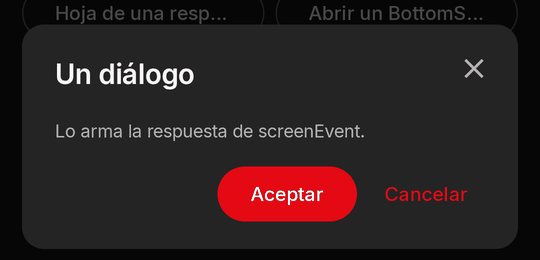
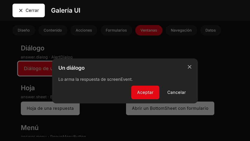
{ "dialog": { "title": "¿Borrar la lista?", "titleEn": "Delete the list?", "body": "No se puede deshacer.", "bodyEn": "It cannot be undone.",
  "buttons": [{ "label": "Borrar", "labelEn": "Delete", "event": "deleteList", "variant": "primary" }, { "label": "Cancelar", "labelEn": "Cancel", "variant": "text" }] } }
export async function screenEvent({ name }) {
  if (name === "ask") return { dialog: { title: "¿Seguro?", titleEn: "Are you sure?", buttons: [{ label: "Sí", labelEn: "Yes", event: "yes" }, { label: "No" }] } };
  if (name === "yes") return { toast: "Hecho", toastEn: "Done" };
  return null;
}
- TV: focus stays inside the dialog; its first focus is its first focusable node, else (a body taller than the frame with nothing to focus) the body itself, else its first button, else its close; a body taller than the frame scrolls with Down and Up (keep a button at its end). Only the focused control draws Kino's ring: the frame and a scrolling body never do (scrolling is the cue). Left and Right move between Kino's X and your buttons in the bottom row.
- Phone and TV: a centred dialog on both.
- Limits and mistakes: with more than one of
dialog,sheetandmenuin one answer, the dialog wins. An answer's pop-up never holds aForm, anExpansionTile,bindor thesettingsnode (declare one for that).
Sheet
More room than a dialog for details or a few actions: a bottom sheet on the phone, a side drawer on the TV. From an
answer: sheet: { title, body }; declared: a BottomSheet node.
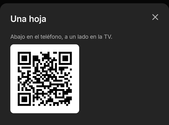
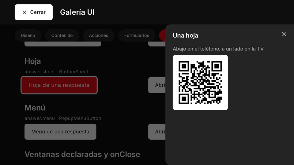
{ "sheet": { "title": "Compartir", "titleEn": "Share", "body": [
  { "type": "Text", "text": "Escanéalo con tu teléfono.", "textEn": "Scan it with your phone." },
  { "type": "QrImage", "value": "https://kinotvapp.github.io/kino-plugins/", "size": "small" }
] } }
export async function screenEvent({ name }) {
  return name === "info" ? { sheet: { title: "Información", body: "Una línea de texto.", bodyEn: "A line of text." } } : null;
}
- Phone and TV: the bottom of the screen on the phone, the side on the TV. Back closes it.
Menu
A short list of actions (1 to 8 items with a label, an optional icon and an onTap); the menu closes before the item's
action runs. From an answer: menu: { title, items }; declared: a PopupMenuButton node opened with { open: key }.
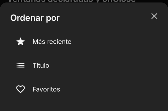
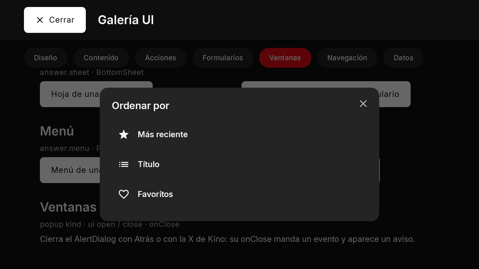
{ "menu": { "title": "Ordenar por", "titleEn": "Sort by", "items": [
  { "label": "Más reciente", "labelEn": "Newest", "icon": "star", "onTap": { "event": "sort", "arg": "new" } },
  { "label": "Título", "labelEn": "Title", "icon": "list", "onTap": { "event": "sort", "arg": "title" } }
] } }
export async function screen() {
  return { type: "Column", children: [
    { type: "TextButton", labelText: "Ordenar", onPressed: { ui: [{ open: "sortMenu" }] } },
    { type: "PopupMenuButton", key: "sortMenu", items: [{ label: "Título", onTap: { event: "sort", arg: "title" } }, { label: "Año", onTap: { event: "sort", arg: "year" } }] },
  ] };
}
- Phone and TV: a menu is not anchored to what opened it: on the phone it is an action list at the bottom of the
canvas, on the TV it is centred (to draw one next to a node, see
anchor). - Limits and mistakes: at most 8 items; a menu item keeps
labelandonTap(neverlabelText/onPressed).
Declared pop-ups, ui open and close, onClose
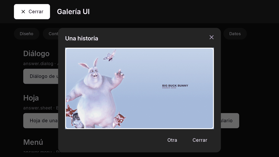
A popup node (AlertDialog, BottomSheet, PopupMenuButton, or popup with its kind) with a key, anywhere in
the tree, hidden until a ui open names it. Its body is part of your tree, so it can hold forms and inputs and your
next render updates it.
| Property | Type | Default | Per size | Notes |
|---|---|---|---|---|
key |
string | required | no | what { open: key } and { close: key } name |
kind |
dialog | sheet | menu |
set by the type | no | AlertDialog is dialog, BottomSheet sheet, PopupMenuButton menu |
title |
string | none | no | titleEn; none (or blank) draws no empty title row |
children |
nodes[] | none | no | the body of a dialog or sheet: forms and inputs allowed |
buttons |
{ label, labelEn?, event?, arg?, variant? }[] |
none | no | a dialog's, at most 3; one without event closes it |
items |
{ label, labelEn?, icon?, onTap }[] |
required for a menu | no | 1 to 8; the menu closes first |
onClose |
event name or { ui?, event?, arg? } |
none | no | runs after the person dismissed it (Back, Kino's close, a tap outside), never after its own buttons |
anchor |
a node's key | none | no | drawn next to that node, over the content, taking no room (anchored pop-up); the only pop-up a player panel draws |
The robust way to open one with new content is from the answer, not from the tap: the tap sends the event, the
answer patches the state and carries ui: [{ open }]; Kino opens it once the new tree is drawn, so the pop-up never
shows the last item's body (Back before then cancels it). Close it the same way after its own Save.
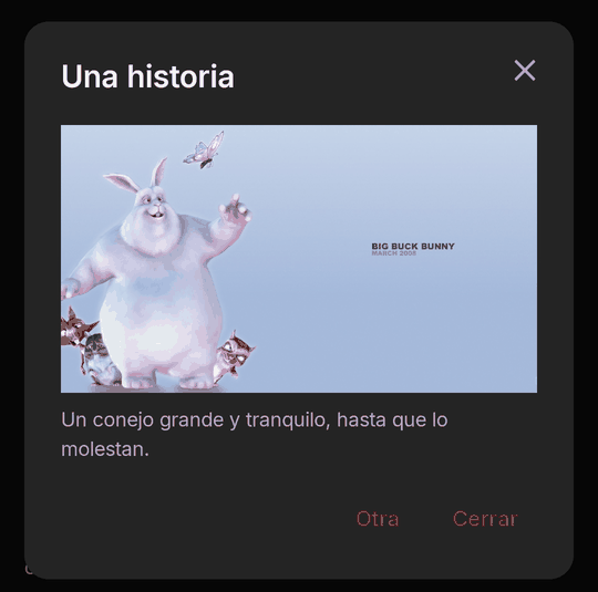
{ "type": "AlertDialog", "key": "story", "title": "Una historia", "titleEn": "A story", "onClose": "storyClosed",
  "children": [{ "type": "Text", "text": "El texto de la historia.", "textEn": "The story's text." }],
  "buttons": [{ "label": "Cerrar", "labelEn": "Close" }] }
export async function screen({ state }) {
  return { type: "Column", children: [
    { type: "ElevatedButton", labelText: "Leer", onPressed: { event: "read", arg: "42" } },
    { type: "AlertDialog", key: "story", title: "Historia " + (state.reading || ""), onClose: "storyClosed", children: [{ type: "Text", text: "…" }] },
  ] };
}

export async function screenEvent({ name, arg }) {
  if (name === "read") return { state: { reading: arg }, ui: [{ open: "story" }] }; // opens once the new tree is drawn
  if (name === "storyClosed") return { state: { reading: null } };                  // the person dismissed it
  return null;
}
onClose(an event name, or{ ui?, event?, arg? }) runs after the person dismissed the pop-up (Back, Kino's close, a tap outside), never after its own buttons, a menu item, yourcloseor another pop-up replacing it. Its event is no press: nokino.qr.scan, nogo.titleByIdsorgo.url; its answer opens no pop-up, moves no focus and goes nowhere (dropped, logged).- TV: focus is trapped inside the open pop-up; Back closes it and focus returns to what opened it.
- Limits and mistakes:
titleis optional (without one no empty row is drawn; never pass" "). A pop-up whose node ishiddencannot open. Whether a pop-up is open is not instate.ui. In a panel in screen mode apopupnode is dropped (pop-ups belong to the screen), unless it has ananchor(below).
Anchored pop-up (anchor)
anchor (a node's key) turns any declared pop-up into a popover: Kino draws it next to that node, above it when there
is more room above, else below, sized to its content and at most the area's width, over the content without dimming it
and taking no layout space. It opens and closes as every pop-up does (ui open and close, Back, a tap outside) and
has no close button of its own. A quick pick beside a button (a reaction, a speed, a sort order):
{ "type": "Row", "children": [
  { "type": "IconButton", "key": "react", "icon": "mood", "labelText": "Reacciones", "labelTextEn": "Reactions",
    "onPressed": { "ui": [{ "open": "palette" }] } },
  { "type": "PopupMenuButton", "key": "palette", "anchor": "react", "items": [
    { "label": "Me gusta", "labelEn": "Like", "icon": "heart", "onTap": { "event": "react", "arg": "like" } },
    { "label": "Me encanta", "labelEn": "Love", "icon": "star", "onTap": { "event": "react", "arg": "love" } }] }
] }
- TV: focus moves into it (its first focusable, or its
autofocusnode) and stays inside while it is open; Back closes it and gives focus back to the anchor. - Player panel: a
popupwith ananchoris the one pop-up a panel in screen mode draws, inside the drawer. - Fallback: when the anchor is not on screen, or there is no room above or below it (a compact window, a tall body),
it is drawn in its kind's own place, logged once. Without
anchorit behaves as before.
Navigation
A node's action or an answer may carry go: one of seventeen shapes, always into this plugin's own content or one of
Kino's own pages. Kino's page opens over your screen; Back returns to it with its state. At most one page-opening go
every 500 ms. No shape names an intent or an app, and only liveChannel, installPlugin and plugin name another plugin
(liveChannel an En vivo provider, whose channel Kino tunes to for a plugin whose player tab joins live channels;
installPlugin a repository whose install sheet Kino opens; plugin, from Kino 0.9.84, a repository whose screen or search
Kino opens). The guide covers go in
Navigation with go.
| Shape | Written | What opens | Sent from |
|---|---|---|---|
title |
{ title: { ref, kind, id, title, adult } } |
this plugin's title page | a tap or an event's answer (never open's, a timer's or an onClose's) |
play |
{ play: { ref, kind, id, title, adult } } |
plays this plugin's title | a tap or an event's answer (never open's, a timer's or an onClose's) |
search |
{ search: { q } } |
Kino's search with q (at most 200 characters), only this plugin as the source (with scope: "all", apiVersion 17, Kino's search on every source, only on the person's tap) |
a tap or an event's answer (never open's, a timer's or an onClose's) |
browse |
{ browse: { ref, title?, titleEn? } } |
this plugin's «Ver más» list for a ref |
a tap or an event's answer (never open's, a timer's or an onClose's) |
section |
{ section: true } |
this plugin's section | a tap or an event's answer (never open's, a timer's or an onClose's) |
categories |
{ categories: true } |
Kino's Categorías, this plugin's group first | a tap or an event's answer (never open's, a timer's or an onClose's) |
close |
{ close: true } |
closes the screen | a tap or an event's answer (never open's, a timer's or an onClose's) |
screen |
{ screen: { route?, args? } } |
this plugin's own screen at route (at most 64 characters) with args (at most 4,096 bytes) |
a tap or an answer, open's included |
titleByIds |
{ titleByIds: { tmdb, imdb, kind, season, episode, title, year } } |
Kino's own title page for TMDB or IMDb ids, with every source the person has | only the person's own press or submit |
url |
{ url: { href, title } } |
an https link in the browser, after Kino's own sheet (a QR code on a TV) | only the person's own press or submit |
copy |
{ copy: { text, label, sensitive } } |
Kino copies text (at most 500 characters, 6 lines) and shows its own «Copiado» toast; a TV cannot |
only the person's own press or submit |
liveChannel |
{ liveChannel: { provider, code } } |
tunes the player to an En vivo provider's channel (only for a plugin whose player tab joins live channels) | only the person's own press or submit |
syncProvider |
{ syncProvider: true } |
Kino's sync-provider settings (Ajustes ▸ Conectar ▸ Proveedor), where the person picks this plugin (only for a plugin with syncProvider) |
only the person's own press or submit |
useTheme |
{ useTheme: { theme } } |
turns on one of this plugin's own appThemes as Apariencia does, or back to Kino's theme with theme: null; Kino shows its own toast |
only the person's own press or submit on your screen, from apiVersion 18 |
setExperience |
{ setExperience: "light" \| "full" } |
asks for the light or the full experience of the whole app; Kino asks the person first and changes nothing without their yes | only the person's own press or submit on your screen, from apiVersion 18 |
installPlugin |
{ installPlugin: { repo } } |
Kino's own install sheet for repo (a plain owner/name); nothing installs without the person's own Instalar |
only the person's own press or submit on your screen, from apiVersion 19 |
plugin |
{ plugin: { repo, route?, args?, query? } } |
another plugin's screen at route with args, or its search for query, found by repo (a GitHub owner/name[/path]); Kino 0.9.84 |
only the person's own press or submit on your screen, from apiVersion 20 |
go.title
Opens this plugin's title page. A title on the canvas (a titleCard, rail or grid
item) opens with that very item (pass its id when two items share a ref); a title that is not on the canvas needs its
id and title (and adult: true when it is 18+).
{ "go": { "title": { "ref": "movie/123", "kind": "movie", "id": "m123", "title": "Una película" } } }
go.play
Plays this plugin's title, written as title. A live channel plays; a series opens its page; a movie, a track or a
podcast episode plays at once. The 18+ gate holds.
{ "type": "ElevatedButton", "labelText": "Reproducir", "labelTextEn": "Play", "onPressed": { "go": { "play": { "ref": "live/1", "kind": "live", "id": "c1", "title": "Canal 1" } } } }
go.search
Kino's search with q filled in and only this plugin as the source (the person sees its chip and may clear it). Refused
for a plugin without search.
{ "go": { "search": { "q": "big buck bunny" } } }
With scope: "all" (apiVersion 17) it opens Kino's normal search across every source instead, with the 18+ gate as usual. Your
plugin learns nothing: not the results, not which plugins exist. It needs no search of yours.
{ "go": { "search": { "q": "big buck bunny", "scope": "all" } } }
go.browse
This plugin's «Ver más» list for a ref (your browse).
{ "go": { "browse": { "ref": "genre/drama", "title": "Drama" } } }
go.section
This plugin's section (its rows of cards).
{ "go": { "section": true } }
go.categories
Kino's Categorías with this plugin's group first; with screen.replaces: ["categories"] your own
screen at the route categories. Refused, logged, for a plugin without its own Categorías tiles.
{ "go": { "categories": true } }
go.close
Closes the screen (the same as the answer's close: true).
{ "type": "TextButton", "labelText": "Cerrar", "labelTextEn": "Close", "onPressed": { "go": { "close": true } } }
go.screen
This plugin's own screen at a route with args, from its other surfaces (its player panel, its home/section/browse
items and rows with open: { screen }, the «Mis plugins» card) or from inside the screen, which starts again at that
route (the state stays). The reserved open event comes again with the new route, so one path loads what the args name.
At most one restart a second. Give a Home row item args, not a route, so the screen opens on your front page (main):
see the recipe A card in Kino's Home that opens your screen.
{ "type": "Button", "variant": "secondary", "labelText": "Ver los ajustes", "labelTextEn": "See the settings", "onPressed": { "go": { "screen": { "route": "main", "args": { "tab": "config" } } } } }
export async function screenEvent({ name, route }) {
  if (name === "open" && route.args?.tab === "config") return { state: { tab: "config" } };
  return null;
}
go.titleByIds
How people with different plugins reach the same title: Kino's own title page (the one a Home TMDB card opens), with
every source the person has. At least one of tmdb and imdb; it names no plugin, ref or URL, never plays, and tells you
nothing back. Only from the person's own press or submit.
{ "type": "ElevatedButton", "labelText": "Abrir este título", "labelTextEn": "Open this title", "icon": "movie",
  "onPressed": { "go": { "titleByIds": { "tmdb": 10378, "kind": "movie", "title": "Big Buck Bunny", "year": 2008 } } } }
- 18+: while the person's 18+ code is locked it opens only when TMDB says the title is not adult. An
imdbalone costs a TMDB lookup («Buscando el título…»). A series opens whole (no episode focus yet).
go.url
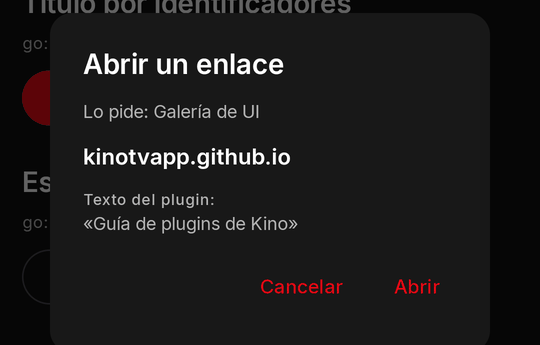
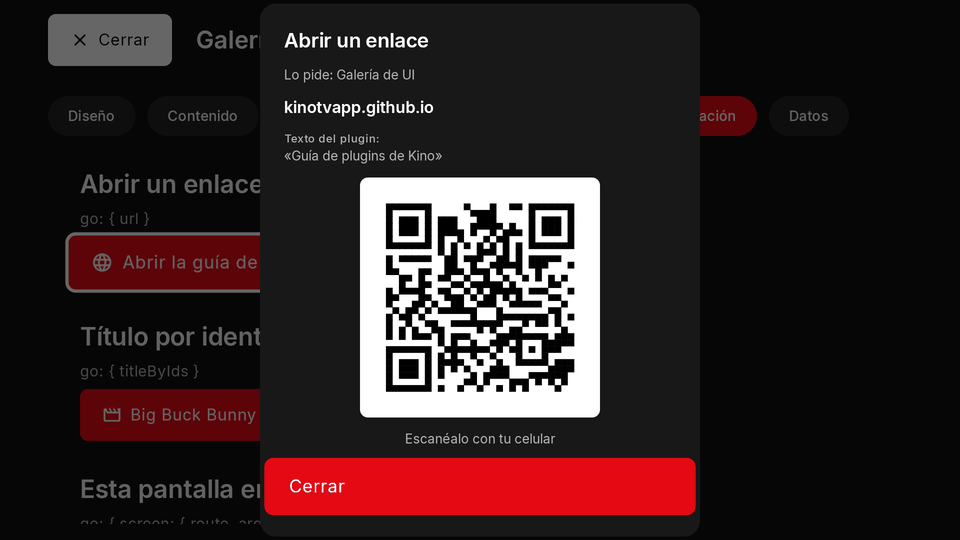
Asks Kino to open an https link in a browser, a «Ver noticia» button. Nothing opens by itself: Kino shows its own
sheet first (your plugin's name, the host with its end always visible, your title under «Texto del plugin:»,
«Cancelar» focused first and «Abrir», inert for its first 600 ms). On a TV, or a phone without a browser, the sheet shows
the link as a QR code to scan.
{ "type": "ElevatedButton", "labelText": "Ver noticia", "labelTextEn": "Read the story", "icon": "language",
  "onPressed": { "go": { "url": { "href": "https://kinotvapp.github.io/kino-plugins/", "title": "Guía de plugins" } } } }
href:https://only, at most 2,048 characters of printable ASCII, a public DNS name with a dot (never an IP,localhost,.local,.lan...), nouser:password@, no port but 443. Only from the person's own press or submit; an answer more than 5 s after the tap drops it. Nothing comes back to you.
go.copy
A «Copiar» button: Kino puts your text on the clipboard itself and always shows its own toast, «Copiado» (or «Copiado:
{ "type": "ElevatedButton", "labelText": "Copiar invitación", "labelTextEn": "Copy invite", "icon": "copy",
  "onPressed": { "go": { "copy": { "text": "Sala: luna roja azul\nCódigo: 4821", "label": "Invitación", "sensitive": true } } } }
text: 1 to 500 characters in at most 6 lines, once control, direction and zero-width characters are removed (newlines stay).label(at most 40) names what was copied in Kino's toast.sensitive: truehides it from the clipboard's preview on Android 13 and later (a room code, a password).- One copy every 500 ms and 20 a minute per plugin. A TV has no clipboard worth using: Kino shows «No se puede copiar en
este aparato»; hide the button there (
kino.device/device: "tv").
go.liveChannel
Tunes Kino's player to an En vivo channel: provider is the id of the plugin that lists it, code the channel's id in
that plugin's listing (what a live tab's context carries as channel). How a Party Chat guest watches the same channel as
the host: the host's tab reads context.channel, sends it to the room, and the guest presses «Ver el mismo canal».
{ "type": "ElevatedButton", "labelText": "Ver el mismo canal", "labelTextEn": "Watch the same channel", "icon": "tv",
  "onPressed": { "go": { "liveChannel": { "provider": "tdt", "code": "la1" } } } }
- Only for a plugin whose approved contributed tab declares
"kinds": ["live"](panel.contributes,playerPanelTab): the same consent; any other plugin's is dropped, loggedneeds_live_tab. Only from the person's own press or submit. - The provider must be an installed, usable plugin with live channels (never
own, «Mis canales»); an 18+ provider only while the 18+ code is unlocked, and an 18+ channel is not found while it is locked (Kino's usual message). - In the player panel on a live channel the channel changes in place (the panel and its pin stay); from anywhere else the panel or screen closes and the player opens the channel. Nothing comes back to you: the next context says the channel.
go.syncProvider
Opens Kino's own sync-provider settings (Ajustes ▸ Conectar ▸ Proveedor), where the person taps «Usar true), and it changes no
choice by itself: Kino never makes a plugin the provider for them.
{ "type": "ElevatedButton", "labelText": "Abrir proveedor de sincronización", "labelTextEn": "Open the sync provider", "icon": "sync",
  "onPressed": { "go": { "syncProvider": true } } }
- Only for a plugin that declares the
syncProvidercapability; any other plugin's is dropped, loggednot_sync_provider. Only from the person's own press or submit, asurlandcopy. - A Kino from before this shape drops the whole
go, logged: keep a written instruction ("Abre Ajustes ▸ Conectar ▸ Proveedor") beside the button so the step still reads on an older Kino.
go.useTheme
From apiVersion 18: a button on your own screen that turns on one of your appThemes, so the person need not go
to Ajustes ▸ Apariencia. One theme is active at a time, so it replaces the one before. theme: null goes back to Kino's theme,
the way out of yours. screen and screenEvent receive activeTheme, the id of your theme active now or null, and Kino calls
screen again after any change (one made in Apariencia too), so one button can flip between turning on and off:
export async function screen({ activeTheme }) {
  const on = activeTheme === "noche";
  return { type: "ElevatedButton", labelText: on ? "Desactivar" : "Activar", labelTextEn: on ? "Turn off" : "Turn on",
    onPressed: { go: { useTheme: { theme: on ? null : "noche" } } } };
}
themeis the only field: one of your manifest'sappThemesids, or null. It does what Apariencia's button does: the same per-profile choice, the same sync, the person's adjustments of that theme kept. A priced theme the person has not bought opens Kino's purchase sheet first (Priced themes).- Only from the person's own press or submit on your screen (a tap, a submit, the answer to one, a pop-up's button): dropped,
logged, from
open, a timer, a change, a load-more, a pop-up'sonClose, a panel or a notice. BelowapiVersion18 it is dropped. - Refused, logged, with nothing changed, when Apariencia does not list that theme as yours (another plugin's id, your plugin off
in this profile, 18+ while locked).
theme: nullacts only while your own theme is active, so you can never reset another plugin's. - Kino shows its own toast, «Tema aplicado» or «Volviste al tema de Kino»; the app repaints at once, your screen included.
go.setExperience
From apiVersion 18: a button on your own screen that asks for the light or the full experience of the whole app, the
two presets of Ajustes ▸ Experiencia visual (light: no shadows, no effects, square corners; full: every effect on and rounded
corners). A theme that looks best with one of them can also say so with its experience field, asked
the same way when the theme is turned on.
export async function screen() {
  return { type: "ElevatedButton", labelText: "Usar la experiencia completa", labelTextEn: "Use the full experience",
    onPressed: { go: { setExperience: "full" } } };
}
- The value is the word
"light"or"full". Anything else drops thego, logged. - Kino asks the person first, in its own words, naming your plugin («Tu plugin» pide la experiencia completa. ¿La usamos?), and changes nothing without their yes. When the app already has that experience nothing is asked.
- Only from the person's own press or submit on your screen (a tap, a submit, the answer to one, a pop-up's button): dropped,
logged, from
open, a timer, a change, a load-more, a pop-up'sonClose, a panel or a notice. BelowapiVersion18 it is dropped.
go.installPlugin
From apiVersion 19 (Kino 0.9.81): a button on your own screen that opens Kino's own install sheet for another plugin's
repository (the same preview and consent sheet as Agregar un plugin: what the plugin connects to, then Instalar or
Cancelar), so the person installs a dependency of yours, or a sibling of your catalog, in one tap and one confirmation. The
sheet opens over your screen: the person is not taken to Plugins, and your screen is where they are when they close it.
Nothing installs without the person's own Instalar on that sheet. It is the install gate of the
plugin protocol: a consumer shows it while its provider is missing.
export async function screen() {
  // One button per dependency: the person picks which one to install.
  const needs = [
    { repo: "kinotvapp/kino-plugin-archive", label: "Instalar Archive", labelEn: "Install Archive" },
    { repo: "kinotvapp/kino-plugin-poster-pro", label: "Instalar Poster Pro", labelEn: "Install Poster Pro" },
  ];
  return { type: "Column", children: needs.map((n) => (
    { type: "ElevatedButton", labelText: n.label, labelTextEn: n.labelEn, onPressed: { go: { installPlugin: { repo: n.repo } } } })) };
}
- The only field is
repo, a plain GitHubowner/nameof at most 100 characters, kept as you wrote it (case untouched). A URL (anything with://), a sub-path (owner/name/dir), a@refor any other field drops thego, logged. - If that plugin is already installed Kino opens nothing and shows its own toast («Ese plugin ya está instalado» / "That plugin
is already installed"). To show «Instalado» instead of a button, declare the repositories in the manifest's
recommendsand readinstalled. - One
goopens one repository. To offer several dependencies, show one button each (the list above is the recommended shape), never a single button that tries to install them all: the person decides each one. - Only from the person's own press or submit on your screen (a tap, a submit, the answer to one, a pop-up's button): dropped,
logged, from
open, a timer, a change, a load-more, a pop-up'sonClose, a panel or a notice. BelowapiVersion19 it is dropped.
go.plugin
From apiVersion 20 (Kino 0.9.84, not published yet): a button on your own screen that opens another plugin's screen, or
its search, from its GitHub repository. It is the piece behind share cards.
{ type: "ElevatedButton", labelText: "Ver en Mi anime", labelTextEn: "Open in Mi anime", onPressed: { go: { plugin: {
  repo: "your-user/kino-plugin-anime", route: "detail", args: { id: "frieren" }, query: "Frieren" } } } }
repois a GitHubowner/name, with an optional sub-path, of at most 200 characters; a URL or an@refdrops thego, logged.routeis ago.screenroute,argsa JSON object within thego.screencap andquerya text of at most 200 characters. Any other field drops thego, logged.- In order: not installed, so Kino shows its install sheet and continues once the person installs it; 18+ and locked, so
nothing opens and Kino shows its toast; off, so Kino asks «¿Activar?»;
routein the plugin'sopenFrom.routes, so that screen opens withargs; aquerysent and the plugin has a search, so Kino's search opens scoped to it; otherwise its section or its screen's default page; and with nothing to open, a toast. A route the target does not list is never opened. The detail:go.pluginandopenFrom. - Only from the person's own press or submit on your screen: dropped, logged, from
open, a timer, a change, a load-more, a pop-up'sonClose, a panel or a notice. BelowapiVersion20 it is dropped.
Recommended plugins and installed (Kino 0.9.81)
Declare the plugins yours works better with in kino-plugin.json, at any apiVersion (an older Kino ignores the field):
{ "recommends": ["kinotvapp/kino-plugin-archive", "kinotvapp/kino-plugin-poster-pro"] }
A list of at most 8 plain GitHub owner/name strings (no URL, no sub-path, no @ref, at most 100 characters each; the case you
write is kept and a repeat, ignoring case, collapses into the first). Anything else makes the manifest invalid:
The "recommends" field must be a list of at most 8 plain GitHub owner/name repositories.
screen and screenEvent then receive installed, an object with one key per entry of your own recommends, written exactly
as you wrote it, true when that plugin is installed now on this device and false when not ({} when you declare none).
Kino never tells you about any other plugin the person has. When it changes while your screen is open (the person installs or
removes one), Kino calls screen again, so a tile can switch from the button to «Instalado». One tile per recommended plugin:
const NEEDS = [
  { repo: "kinotvapp/kino-plugin-archive", name: "Archive" },
  { repo: "kinotvapp/kino-plugin-poster-pro", name: "Poster Pro" },
];

export async function screen({ installed }) {
  return { type: "Column", children: NEEDS.map((n) => installed[n.repo]
    ? { type: "ListTile", title: n.name, subtitle: "Instalado", subtitleEn: "Installed" }
    : { type: "ListTile", title: n.name, subtitle: "Toca para instalar", subtitleEn: "Tap to install",
        onTap: { go: { installPlugin: { repo: n.repo } } } }) };
}
In the kit, node sdk/run.mjs <plugin dir> screen passes installed with every recommends entry false; mark some as
installed with --context '{"installed":{"kinotvapp/kino-plugin-archive":true}}'.
Routes (route push and pop)
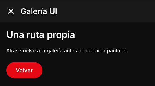
Screens of your own deeper in the canvas: an answer's route: { push: "detail", params } goes one level deeper,
{ pop: true } back; Back pops a pushed route before it closes the canvas. screen({ route }) gets
{ name, params, args? }; name is "main" when the screen was opened without a route (from Kino's Home, from a card, from
the menu), so treat "main" as your front page.
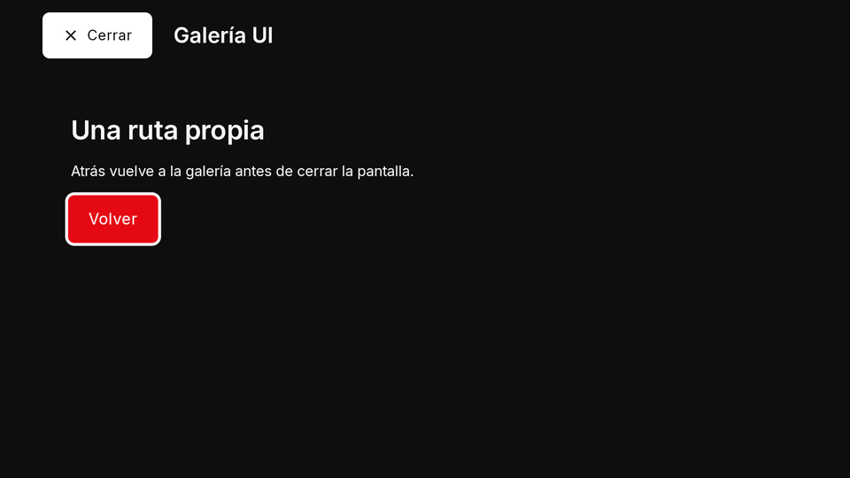
{ "route": { "push": "detail", "params": { "id": "42" } } }
export async function screen({ route }) {
  if (route.name === "detail") return { type: "Column", padding: 16, children: [{ type: "Text", text: "Detalle " + route.params.id }, { type: "TextButton", labelText: "Volver", onPressed: "back" }] };
  return { type: "ElevatedButton", labelText: "Ver detalle", onPressed: { event: "detail", arg: "42" } };
}

export async function screenEvent({ name, arg }) {
  if (name === "detail") return { route: { push: "detail", params: { id: arg } } };
  if (name === "back") return { route: { pop: true } };
  return null;
}